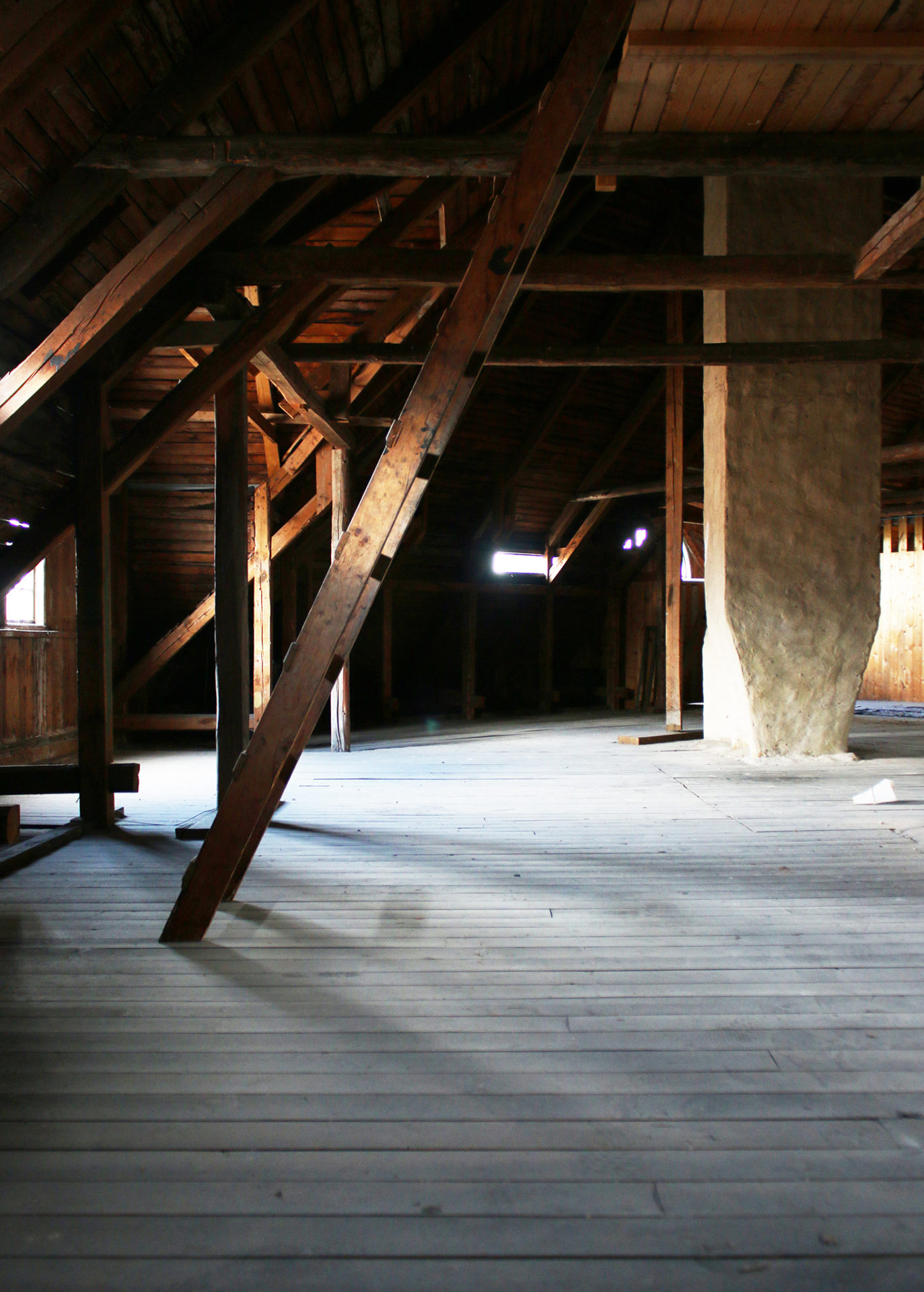
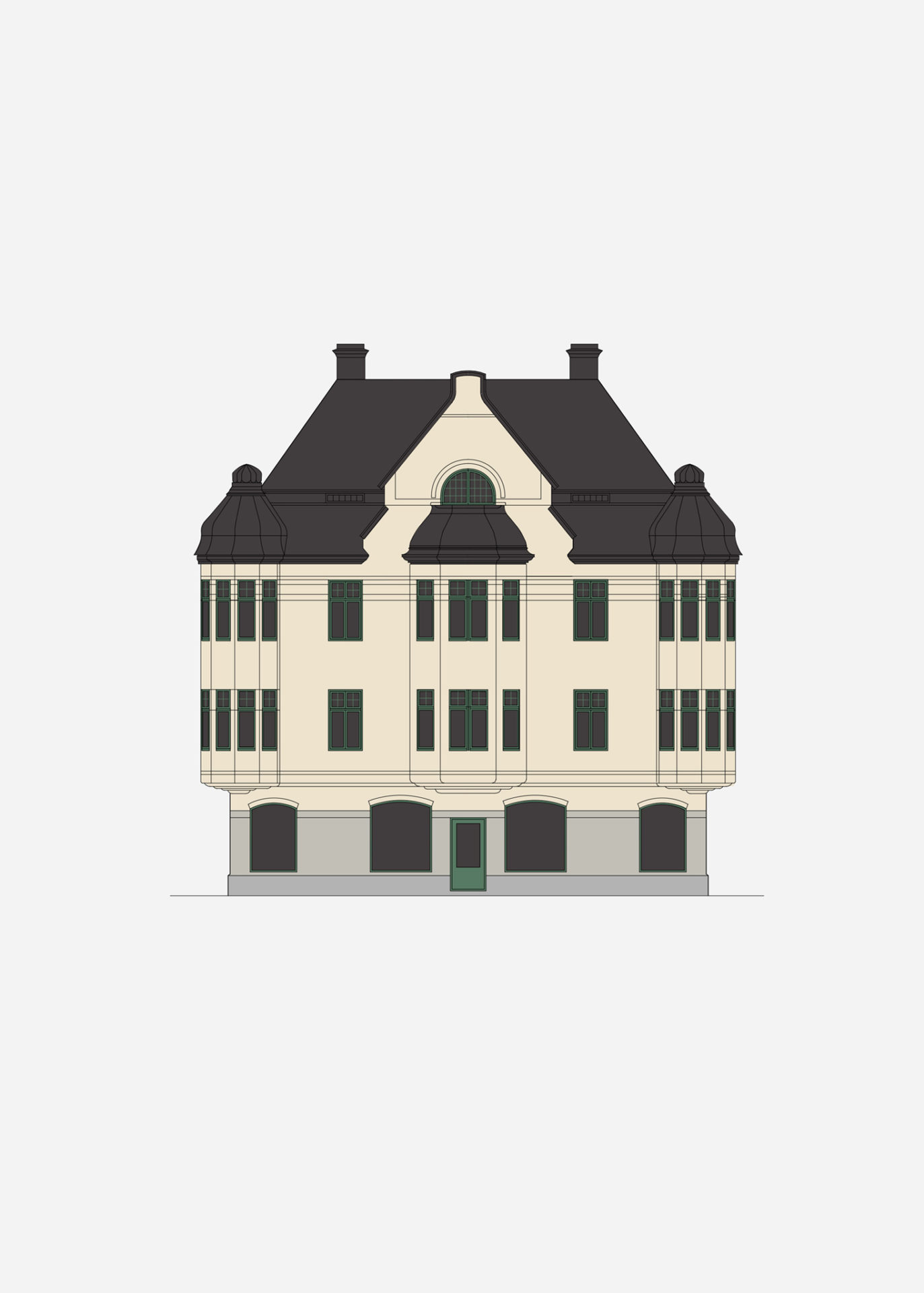
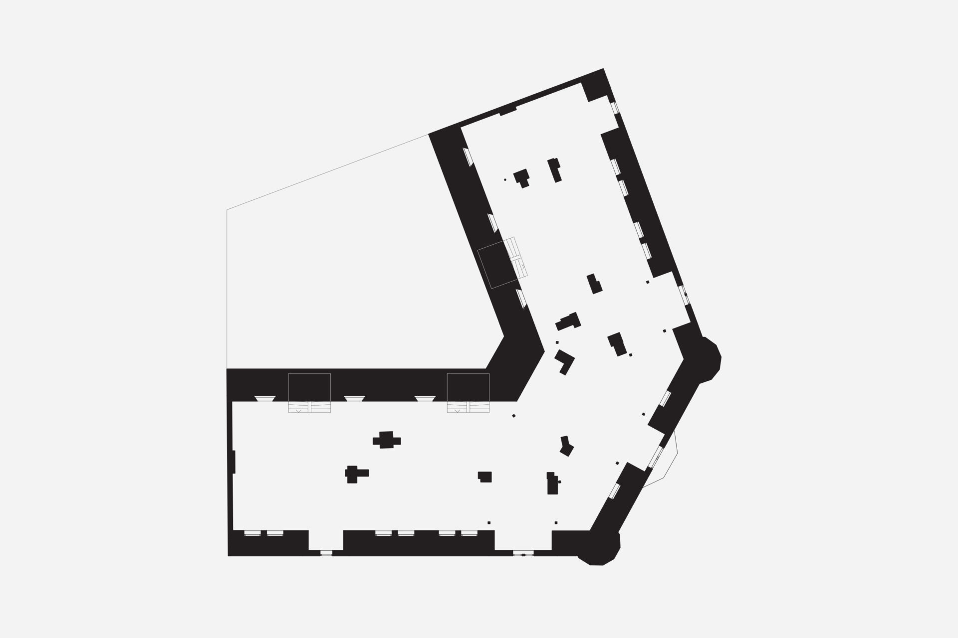
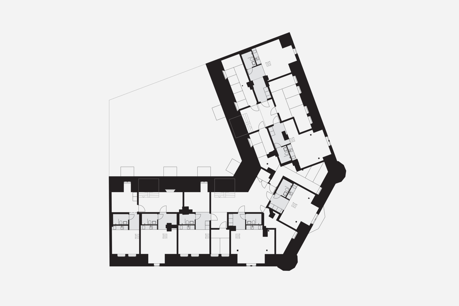
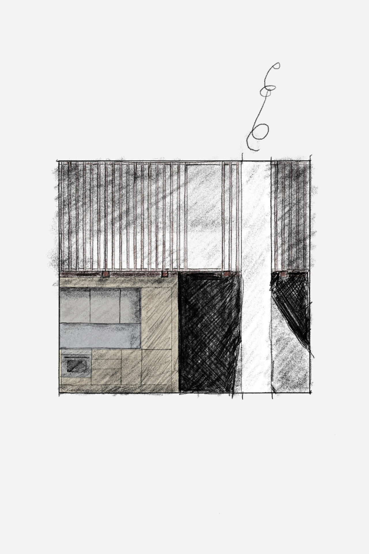
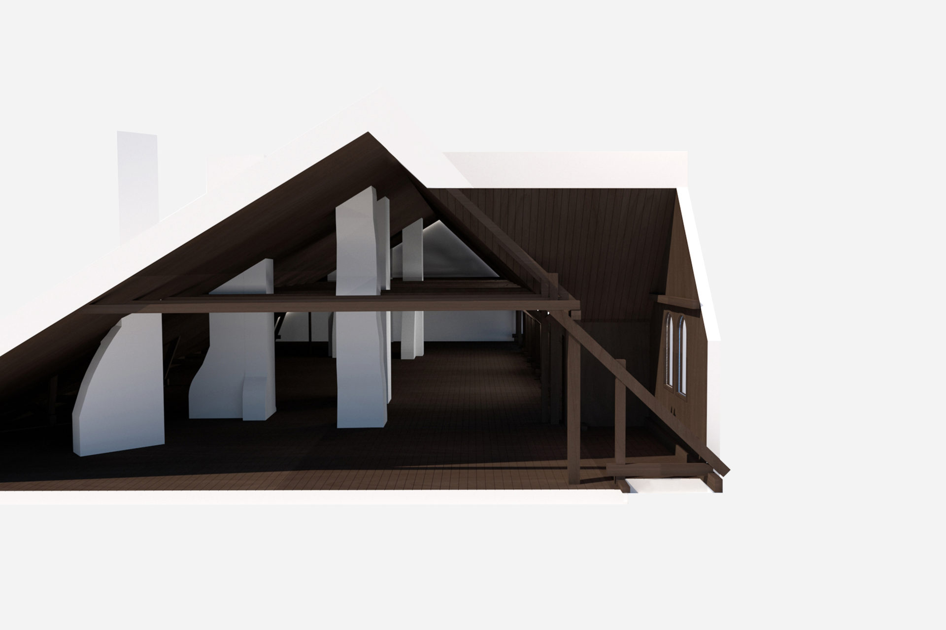
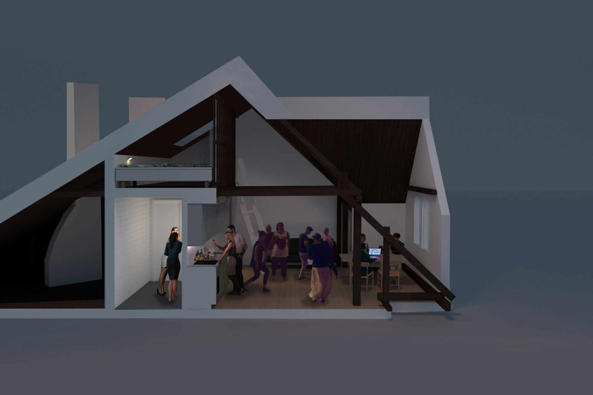
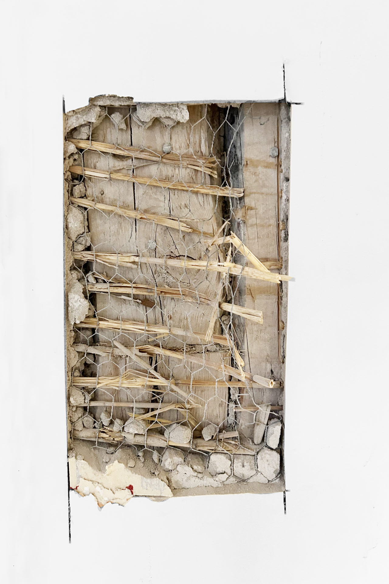
The 1910 Art Nouveau building has had an untouched attic for more than hundred years. Despite some internal and external renovations and changes, the attic has remained basically unused. Around every 60 years, the building seems to face a major renovation and rebuilding project. This time the project means that the entire building is carefully renovated; bathrooms, kitchens, stairwells, retail spaces, roofs and facades. The perfectly southwest facing kitchens also get balconies towards the yard. A number of loft apartments are finally added in the attic which despite facing the street, do not affect the facades towards it. Five frontispieces that give the facades even rhythms come into use. The original appearance is maintained regardless of the big change behind the protected facades.
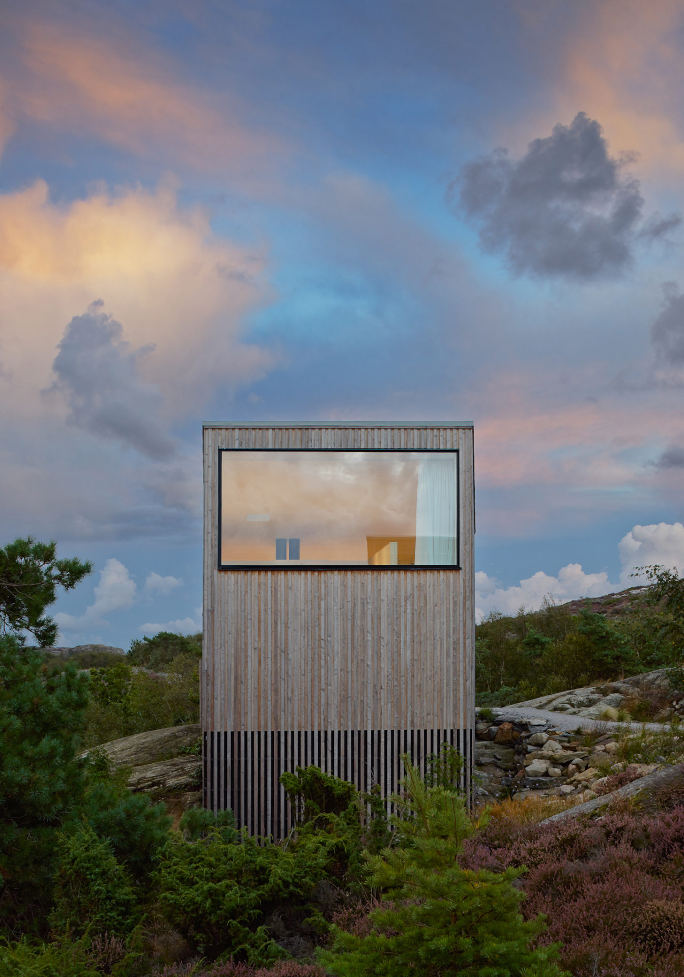
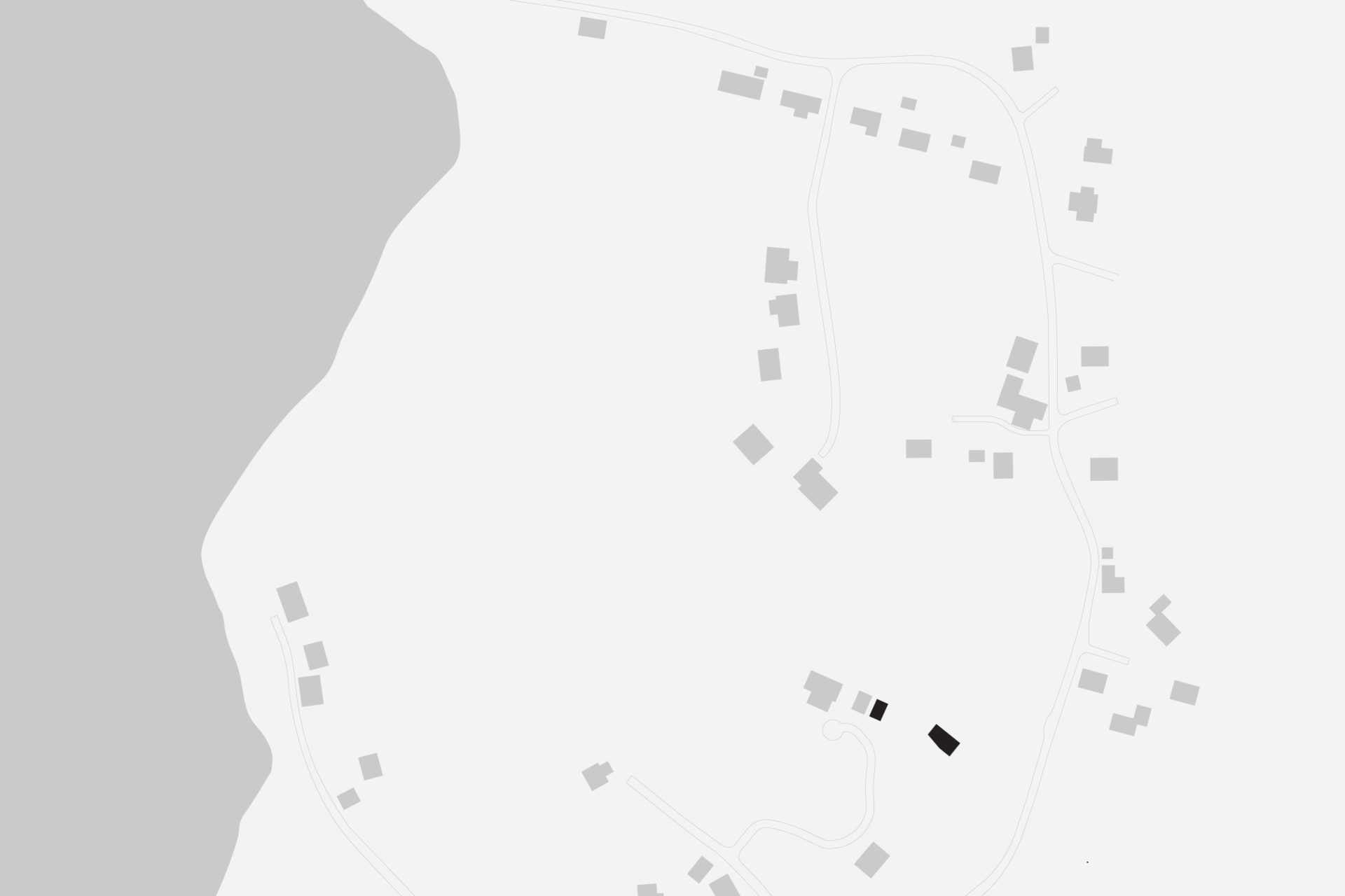
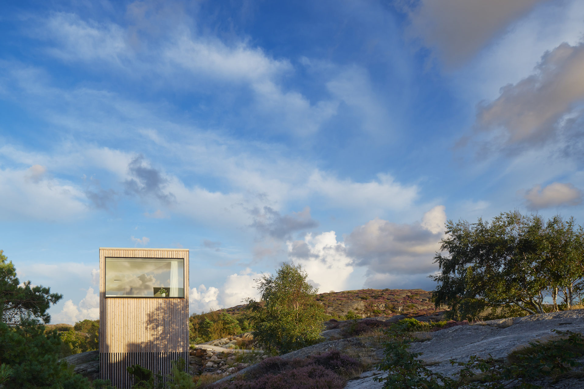
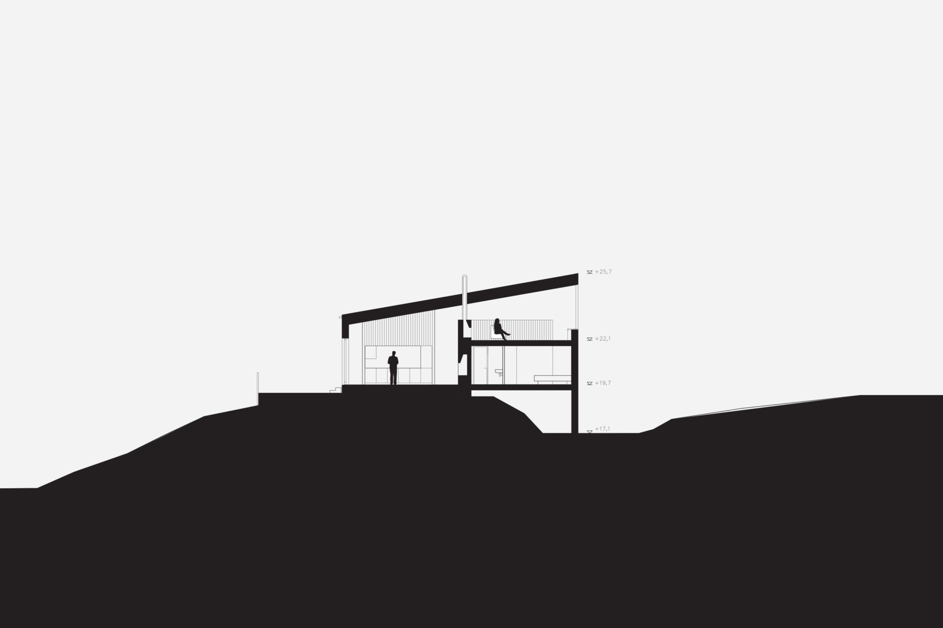
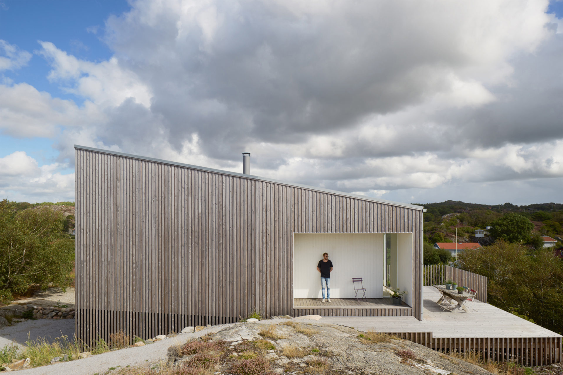
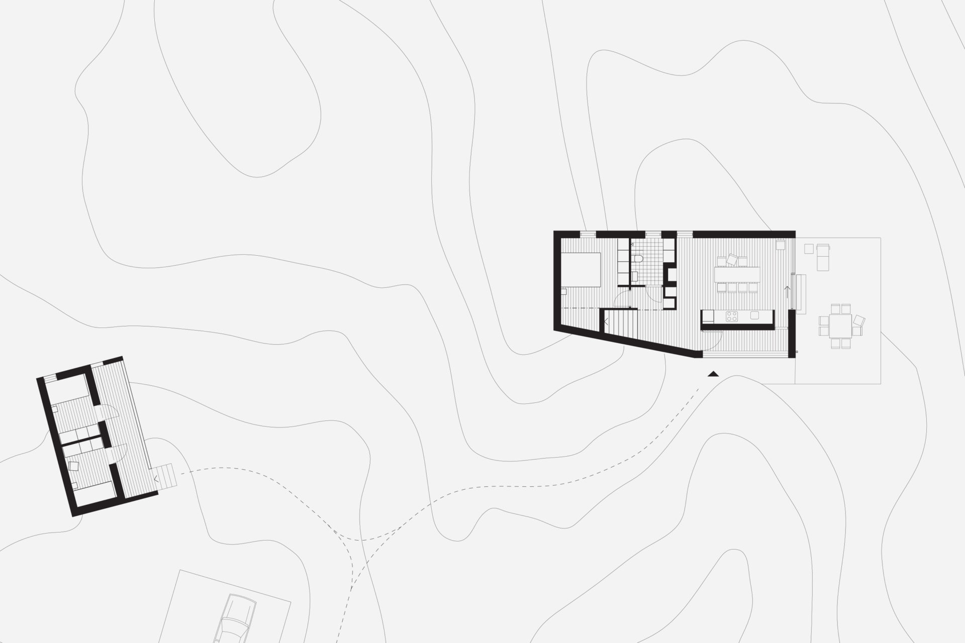
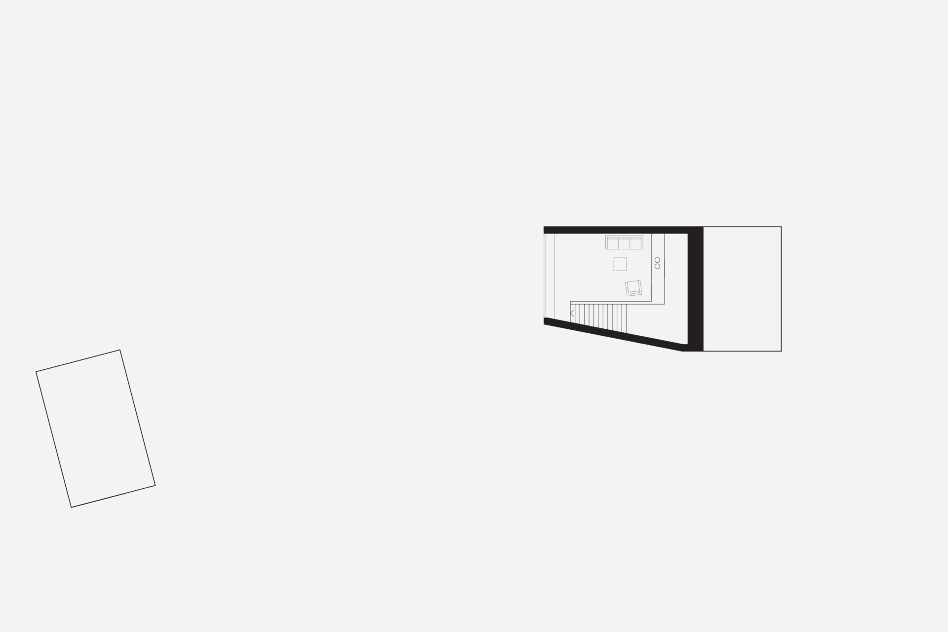
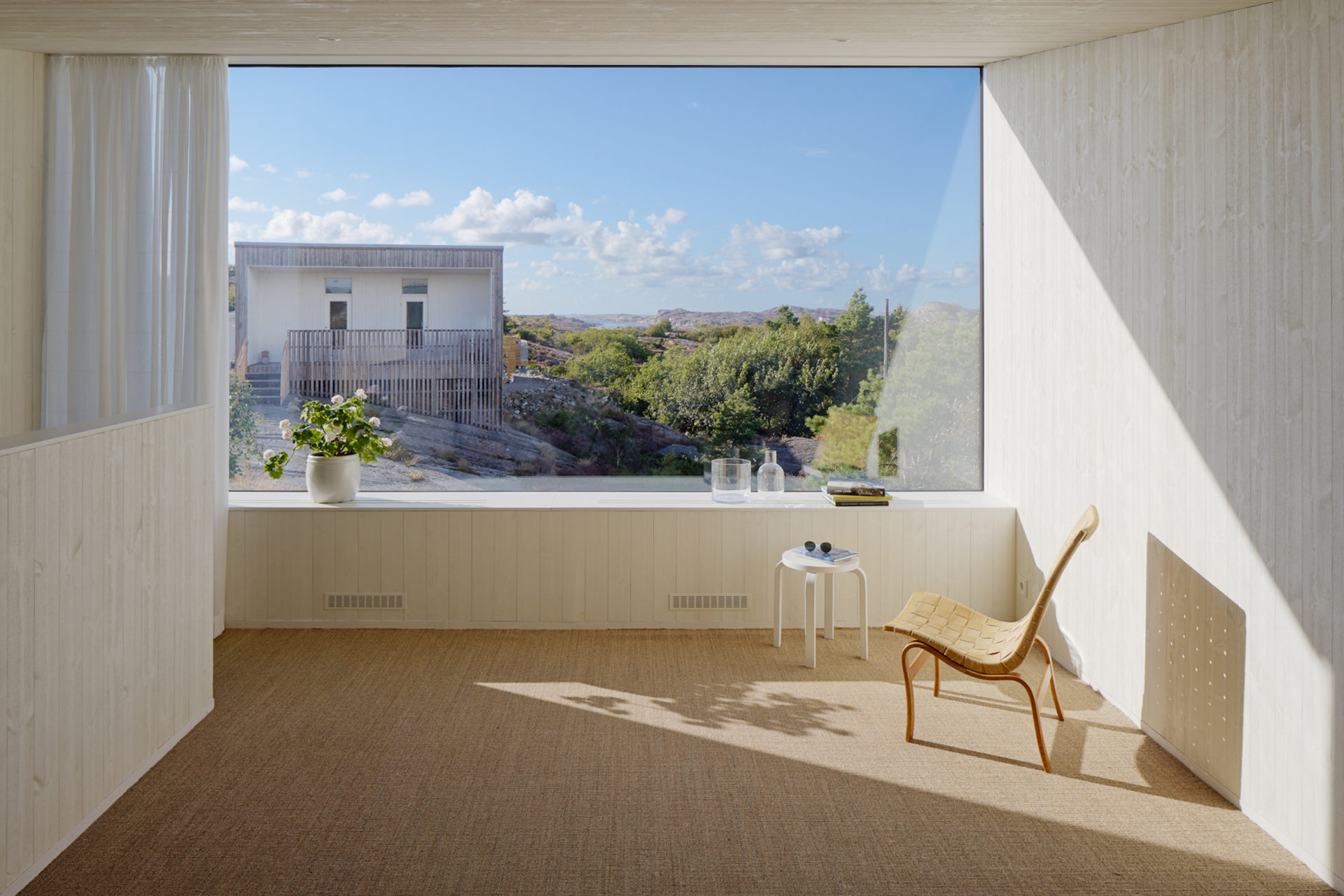
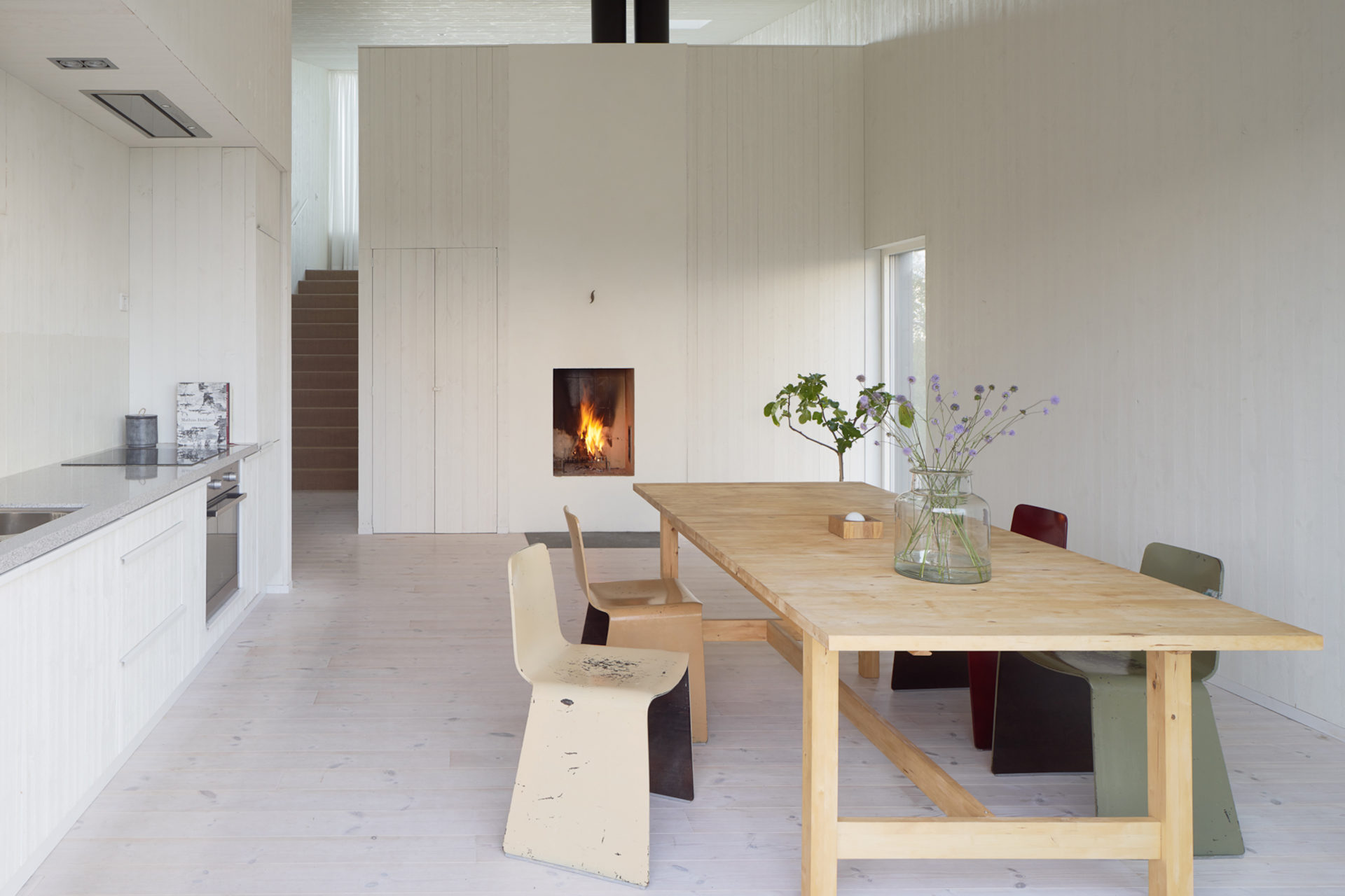
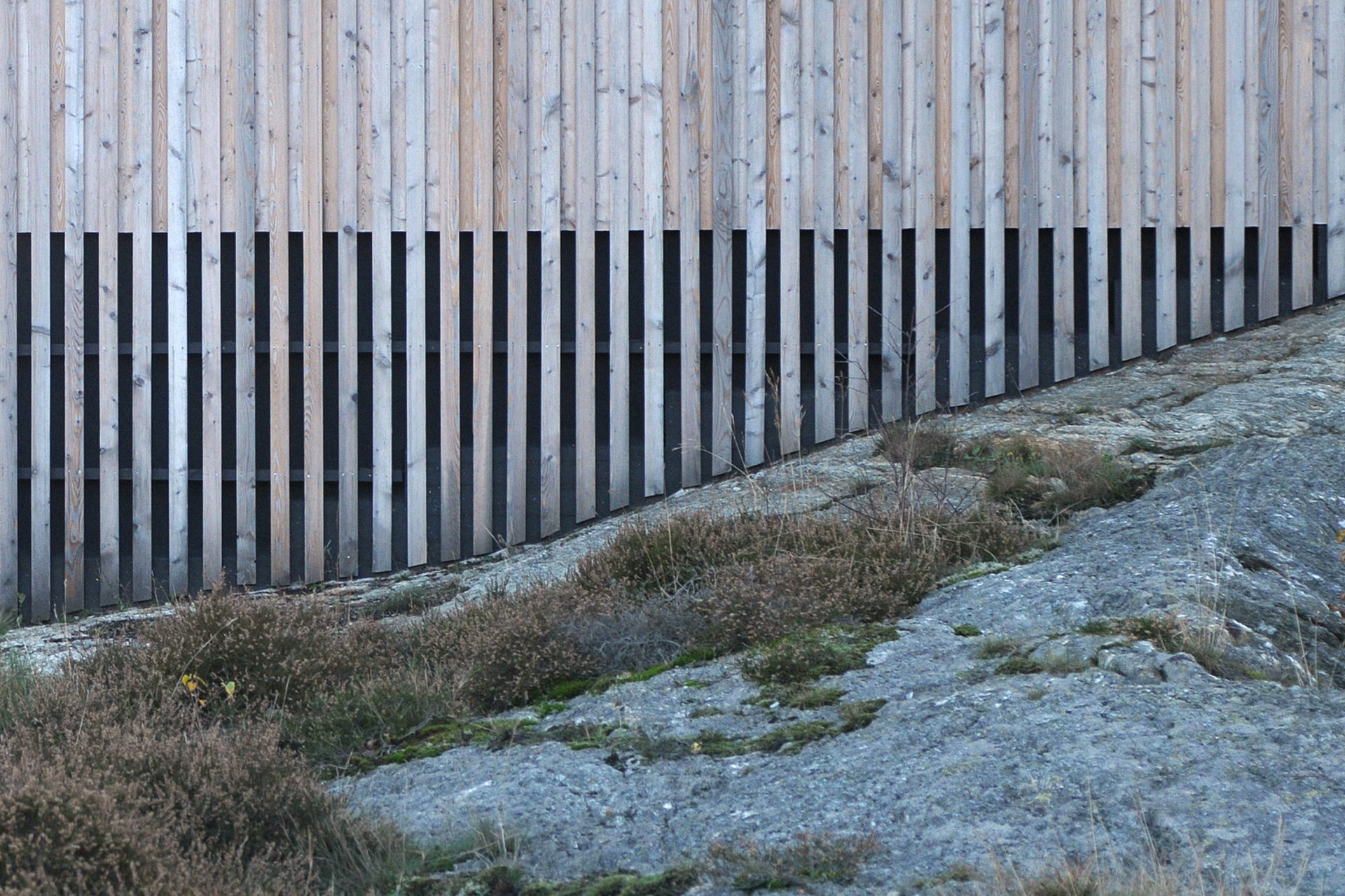
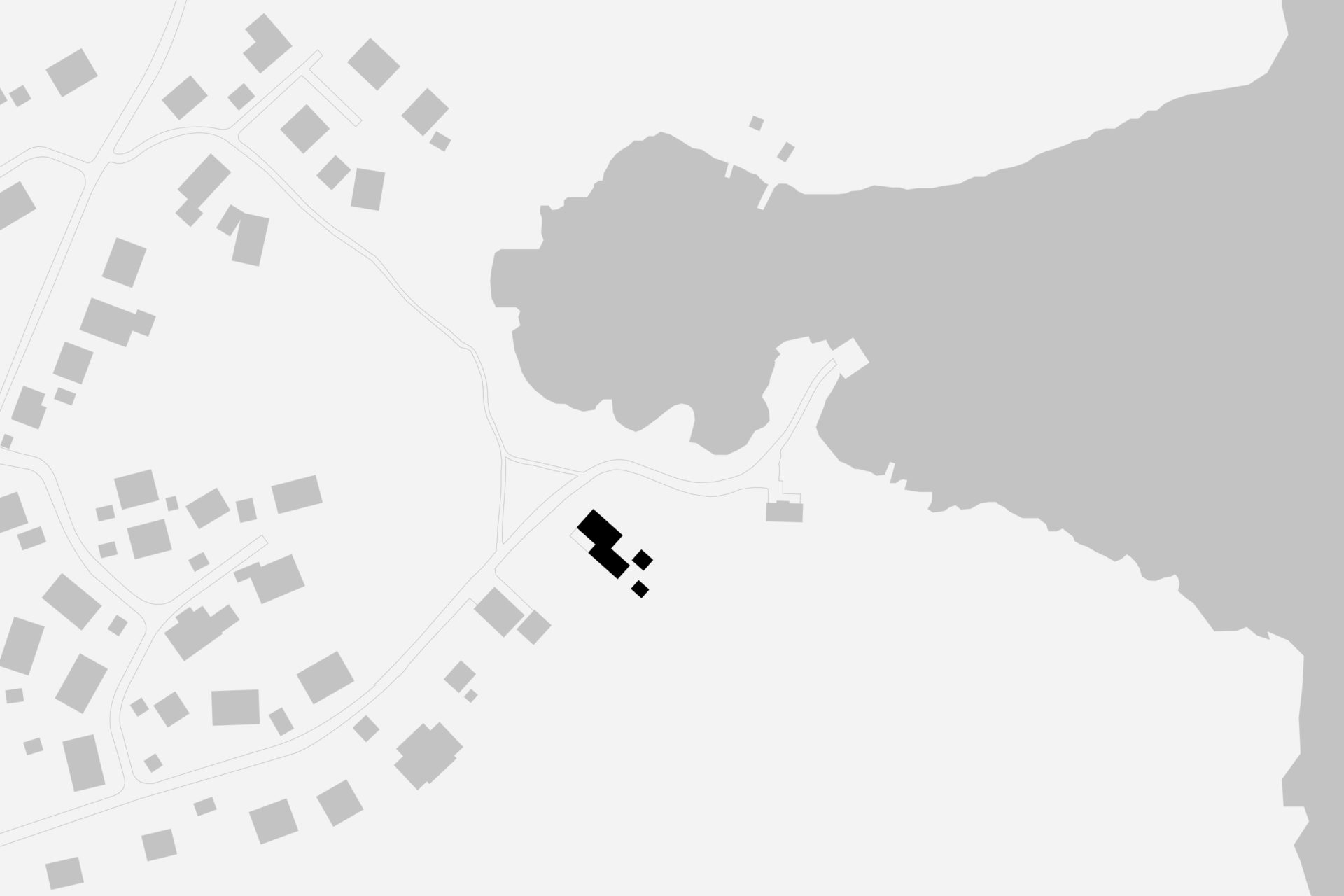
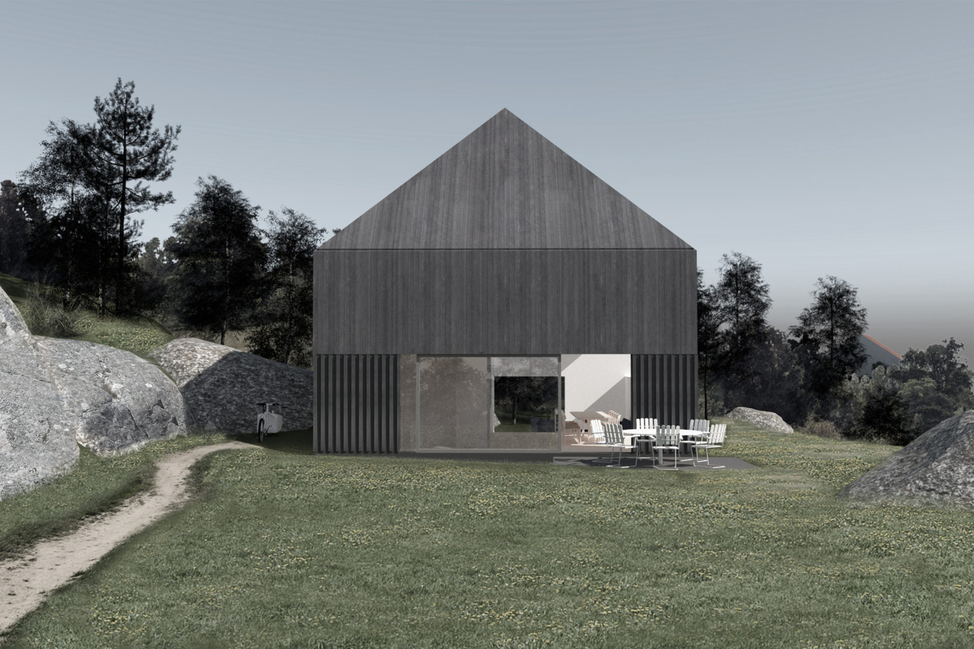
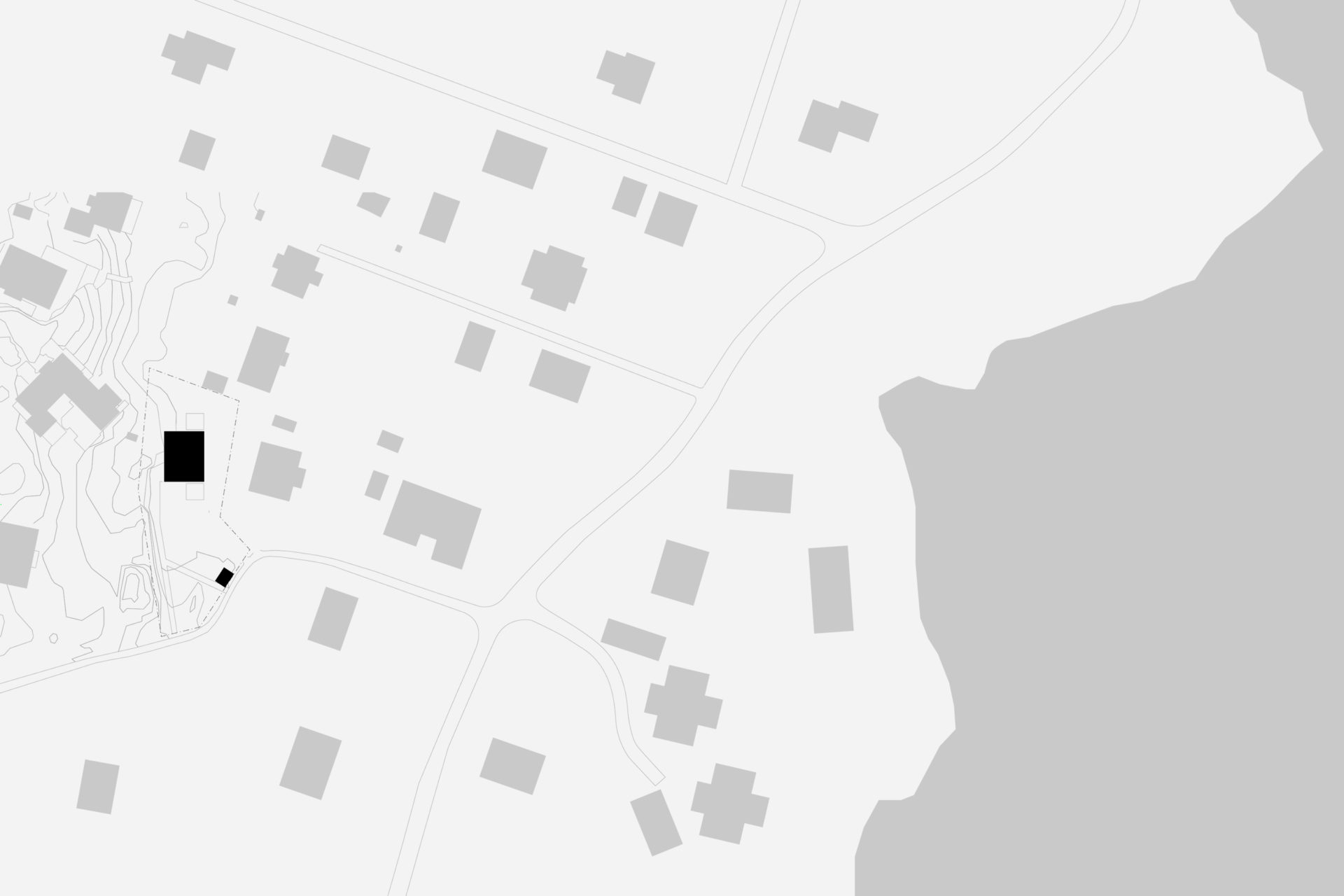
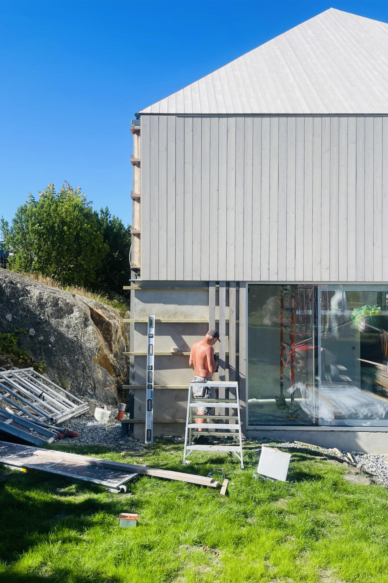
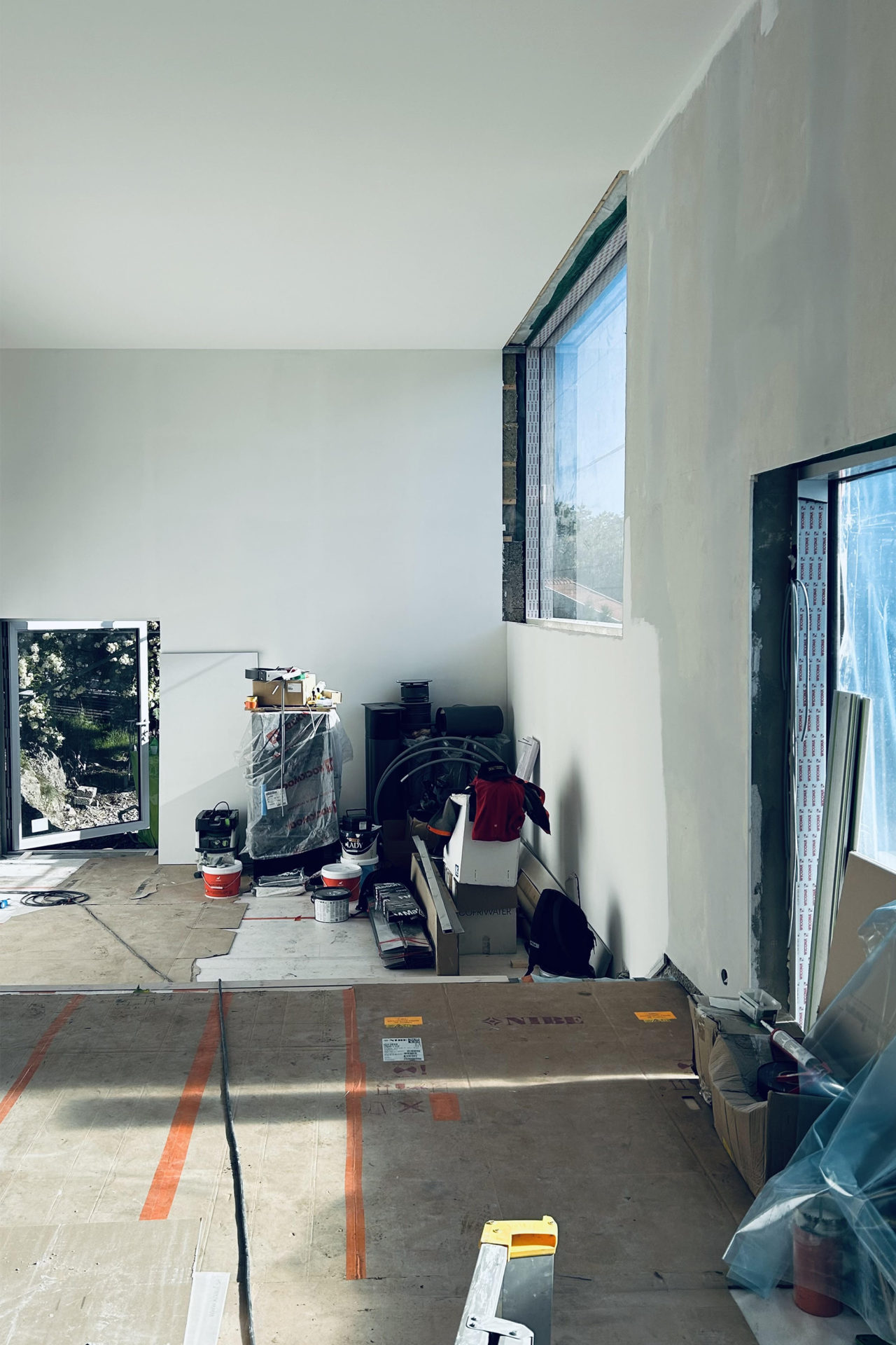
The characteristically barren and hilly terrain was the starting point for our discussion about the location. The possibilities were the deciding factor and the client bought the plot, 1 km from an old fishing settlement and 300 metres from the settlements northern inlet. Two buildings form a pair in a carefully chosen position. The site is up high but not high enough to see the strati from ground level. The terrain and the clients desire for a sea view decided the main building’s section with the upper floor adapted in height to afford a view of the strait. A smaller supplementary building forms a visual barrier towards the neighbours and defines the site boundary. The space between the buildings is taken in possession. The programme is in two parts: the larger house containing kitchen, living room, bedroom and bath and the smaller with two bedrooms for guests. The layout in the main building is based on the idea of gathering around fireplace and vista, an almost primitive layout. The chimney takes the centre point of the building with two fireplaces on top of each other. The living room with the top fireplace on one short side and view on the other, kitchen with the bottom fireplace and view in the opposite direction facing south. The window apertures afford a view of unspoiled nature only. Because of the clients interest in wood, it has been systematically used for structure, facade and interior surfaces. Wood has an unbeatable potential for in situation treatment, which the building’s contact with the ground demonstrates. The facade’s lid passes over the base and is carefully sawn just above the terrain. The buildings respond to the smallest movement and complete our deliberations about the site.
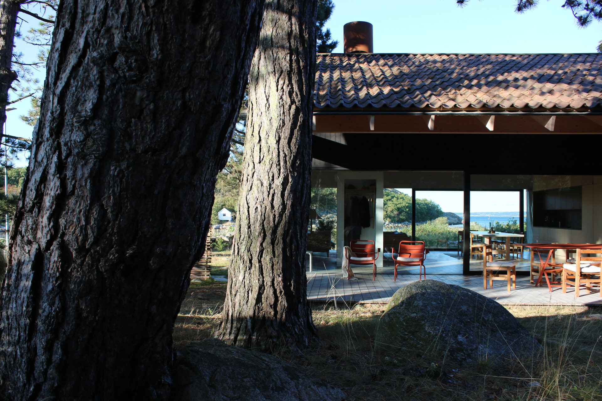
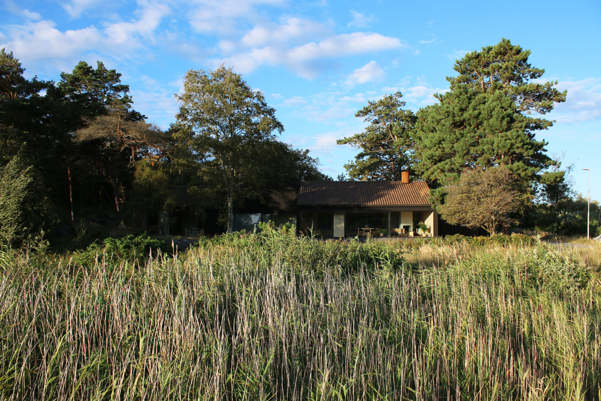
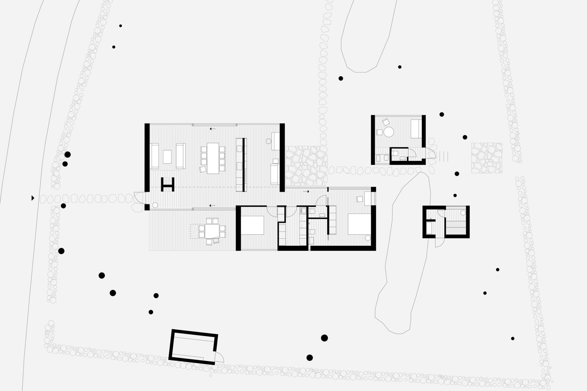
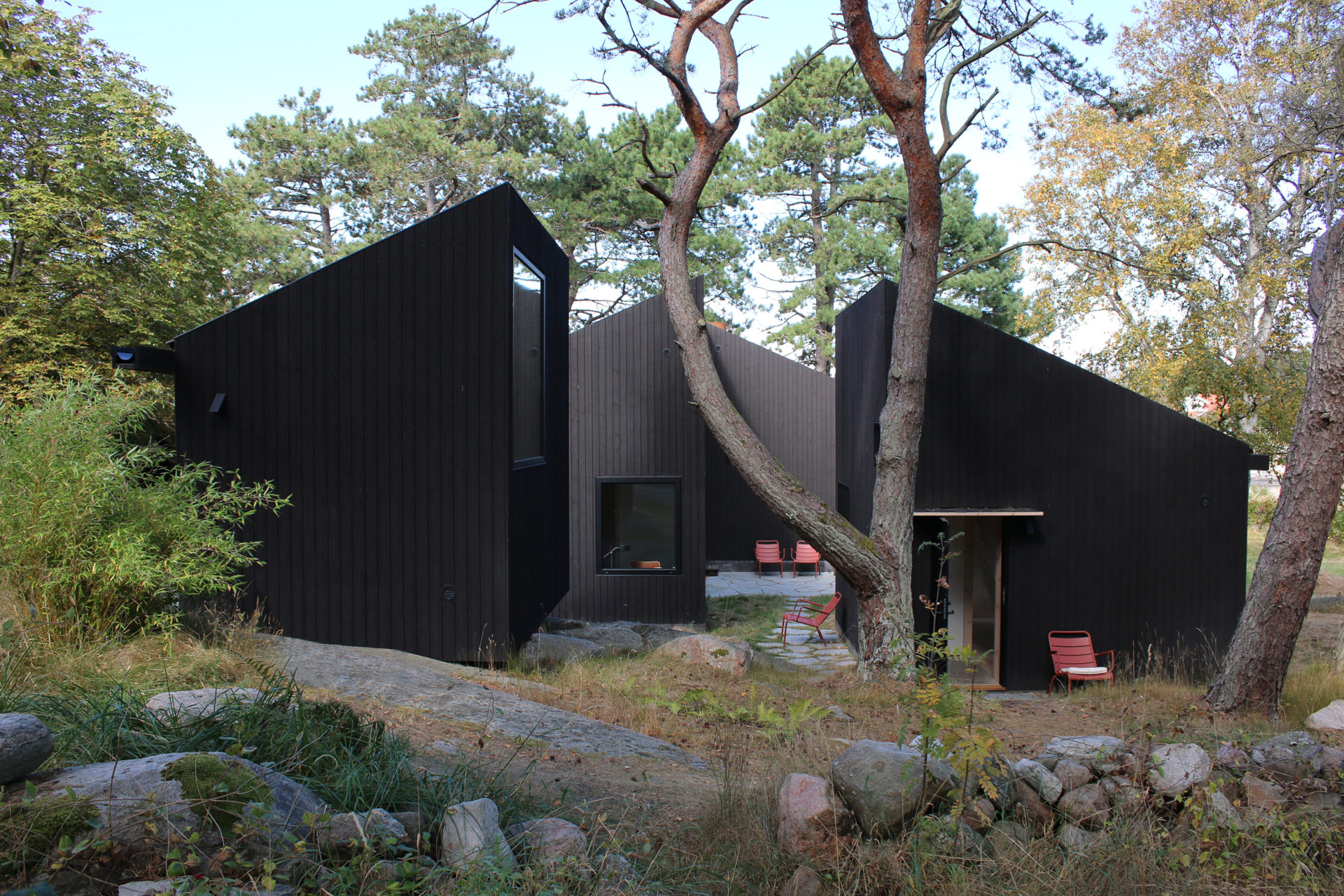
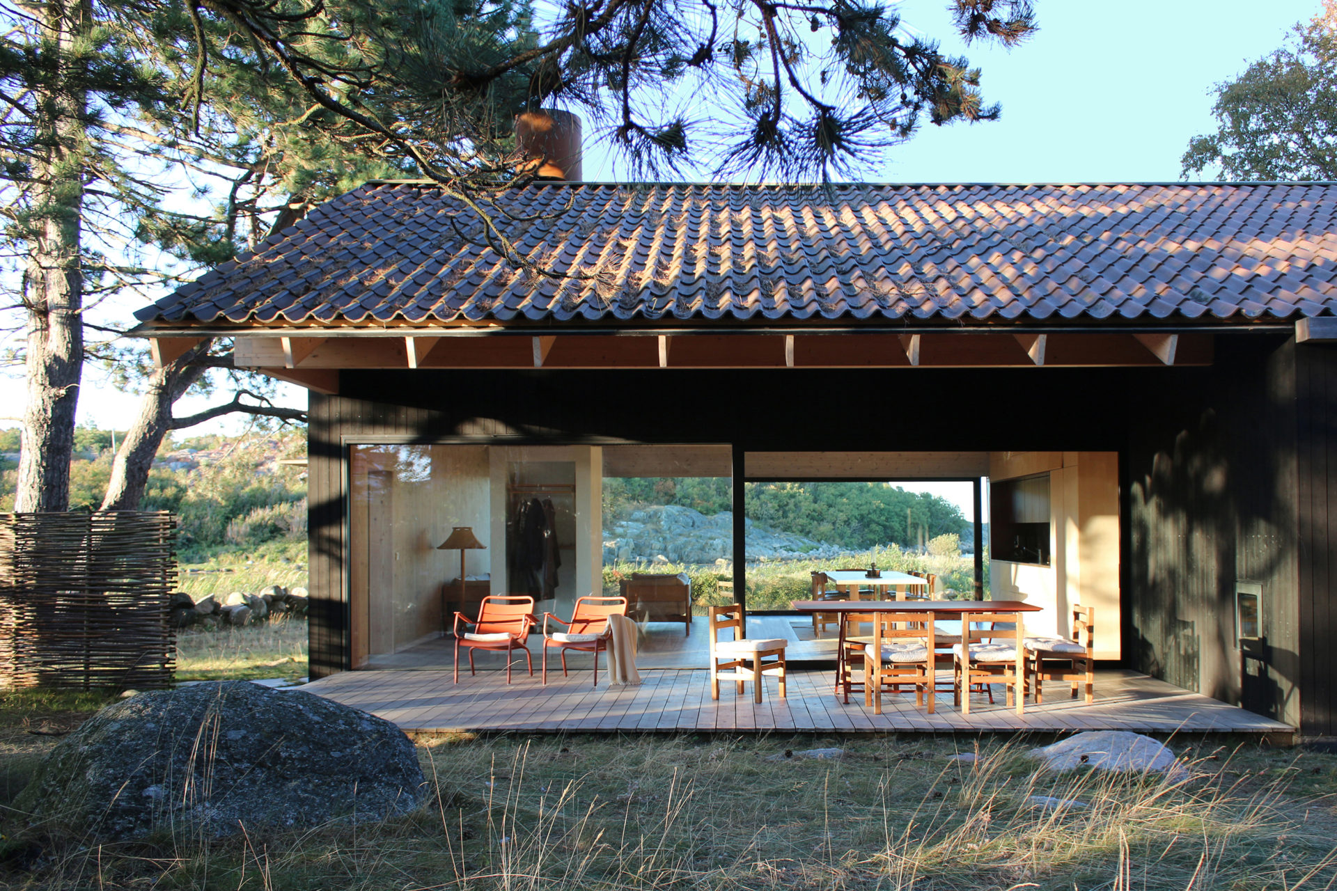
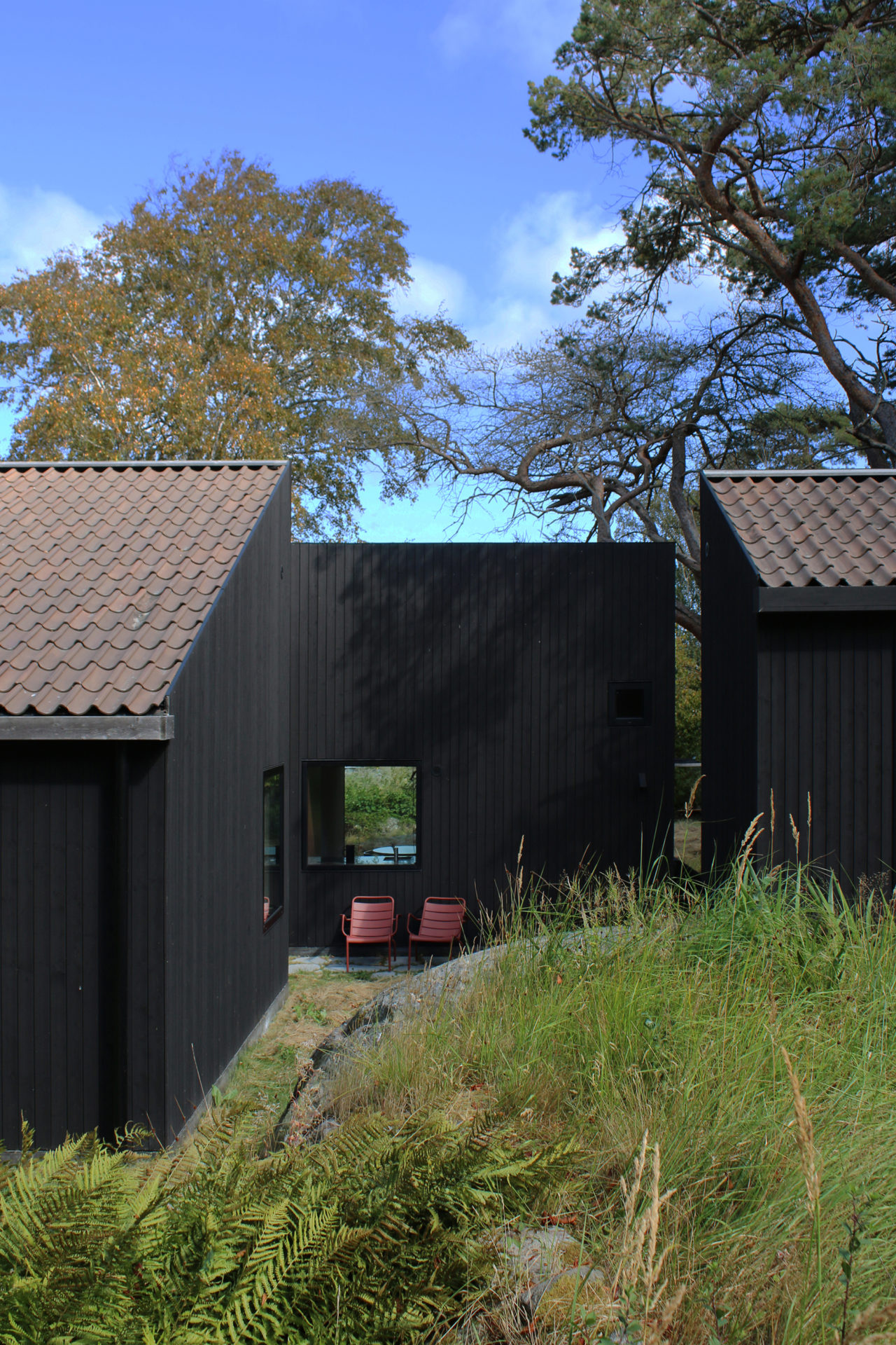
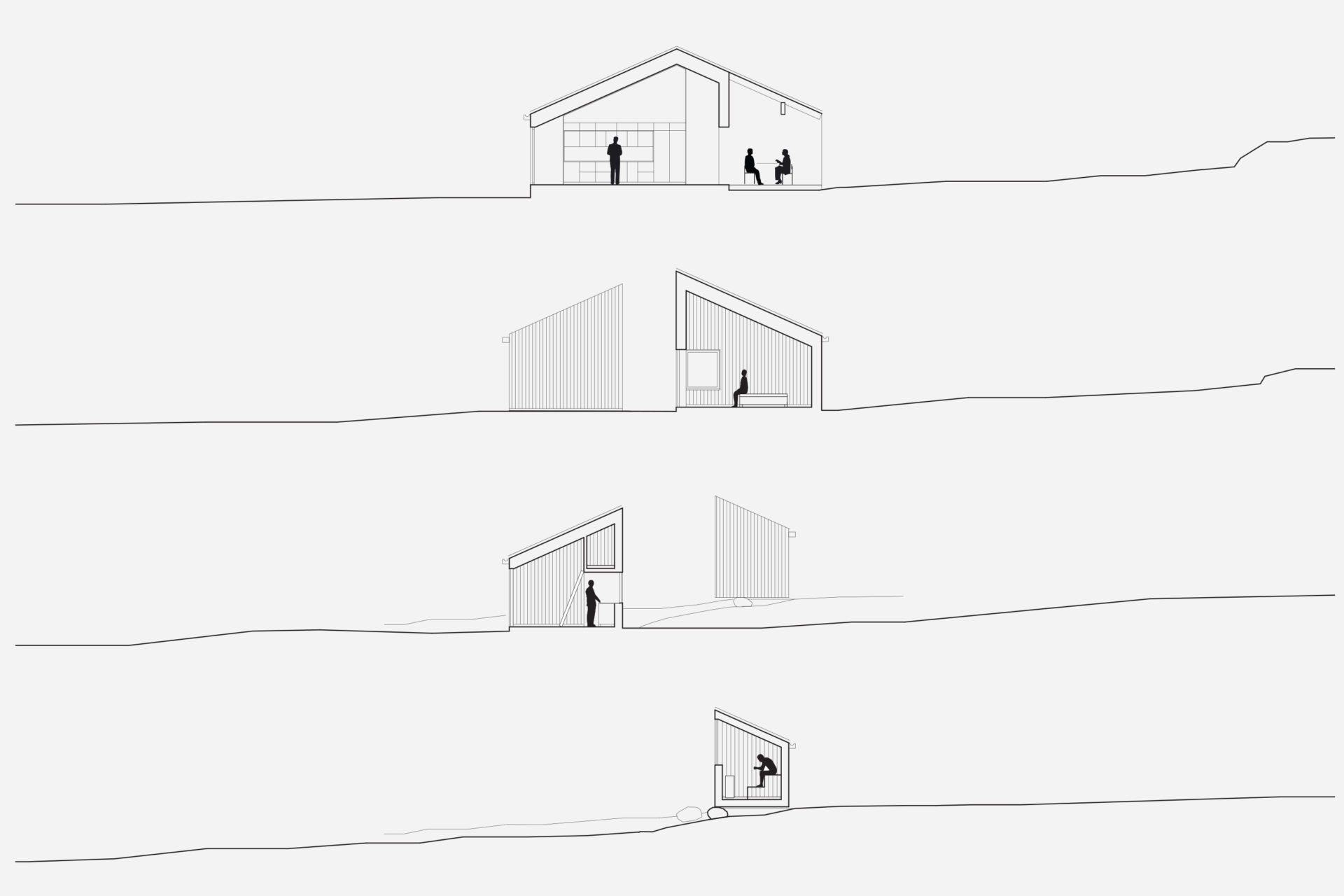
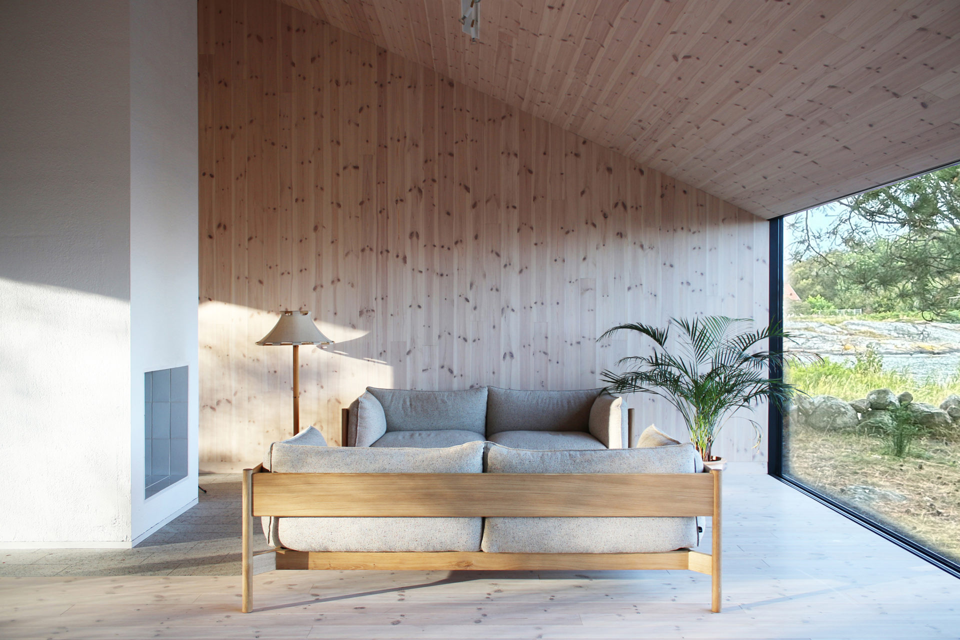
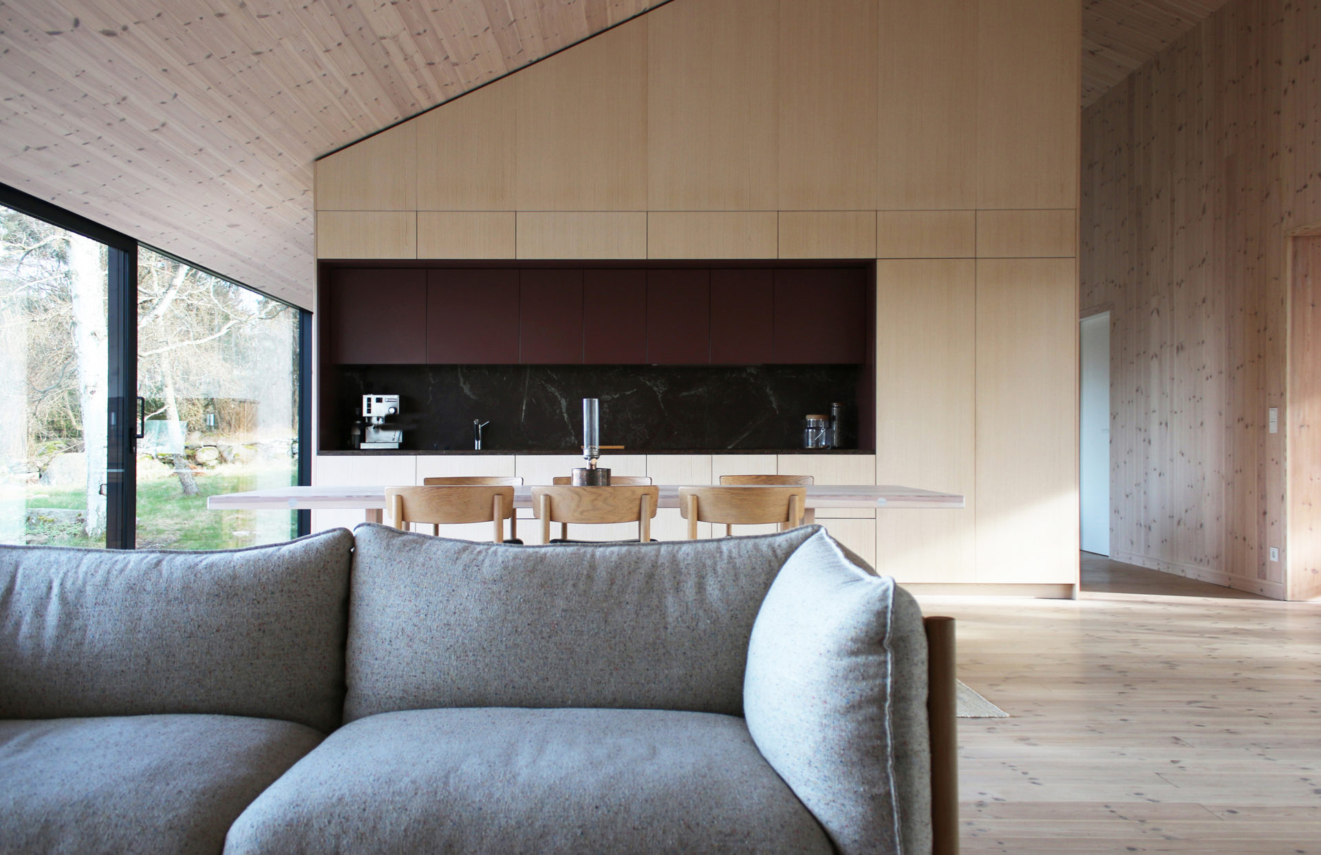
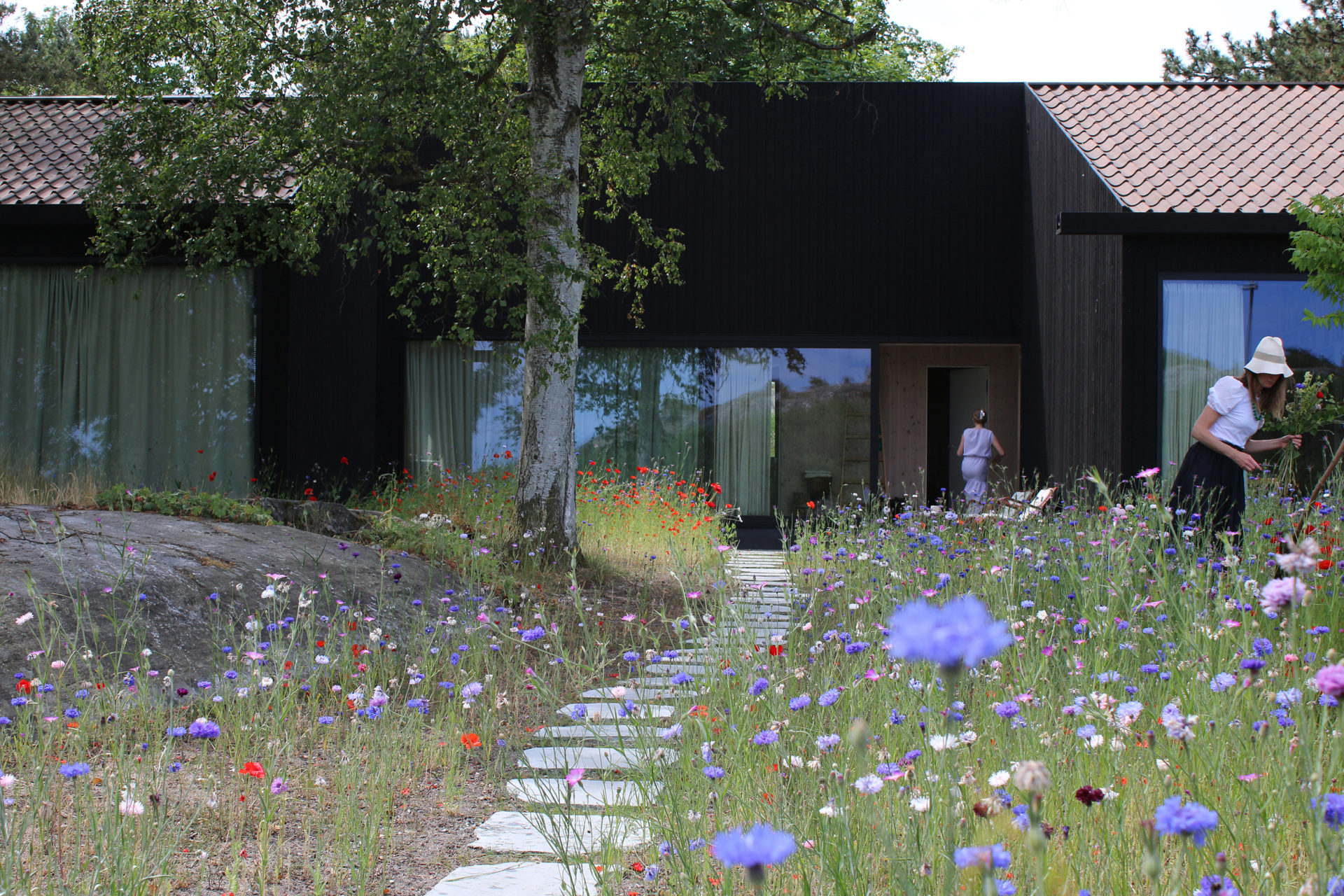
A group of pines that grow with rare force give the place shelter from storms that sweep in regularly. Between the trees, four buildings are placed to seek sun shelter and views with a strategy where outdoor rooms are given equal care as the interior ones. The entrance, living room, kitchen, and terrace form a large transparent space, facing both the sea in the northeast and the evening sun towards the southwest. Serving functions are conversely closed, turned away from the sea. In the quietest position of the house is the master bedroom. The freestanding guesthouse is like a boat, all everyday functions are on a compressed surface independent of the other buildings. At the far end of the plot, in the most secluded location is the sauna. With a foundation on boulders found on site, the building takes a step up into the slightly sloping terrain. Between pines, in the protection of surrounding buildings, it scouts down towards the sea.
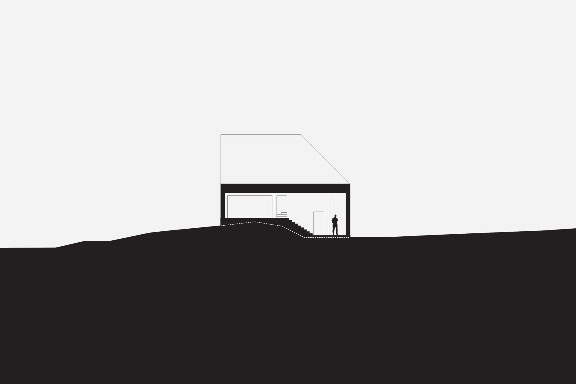
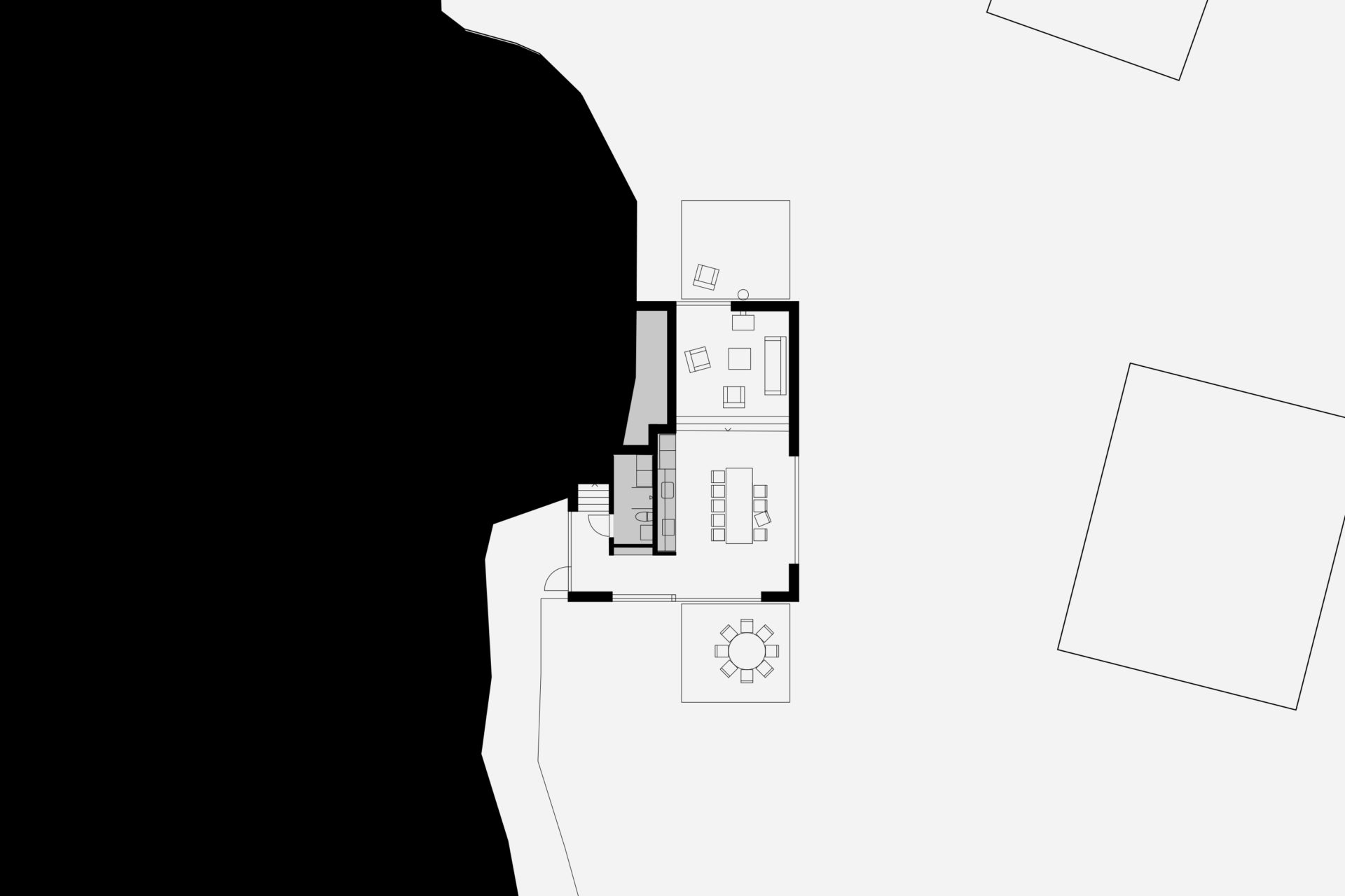
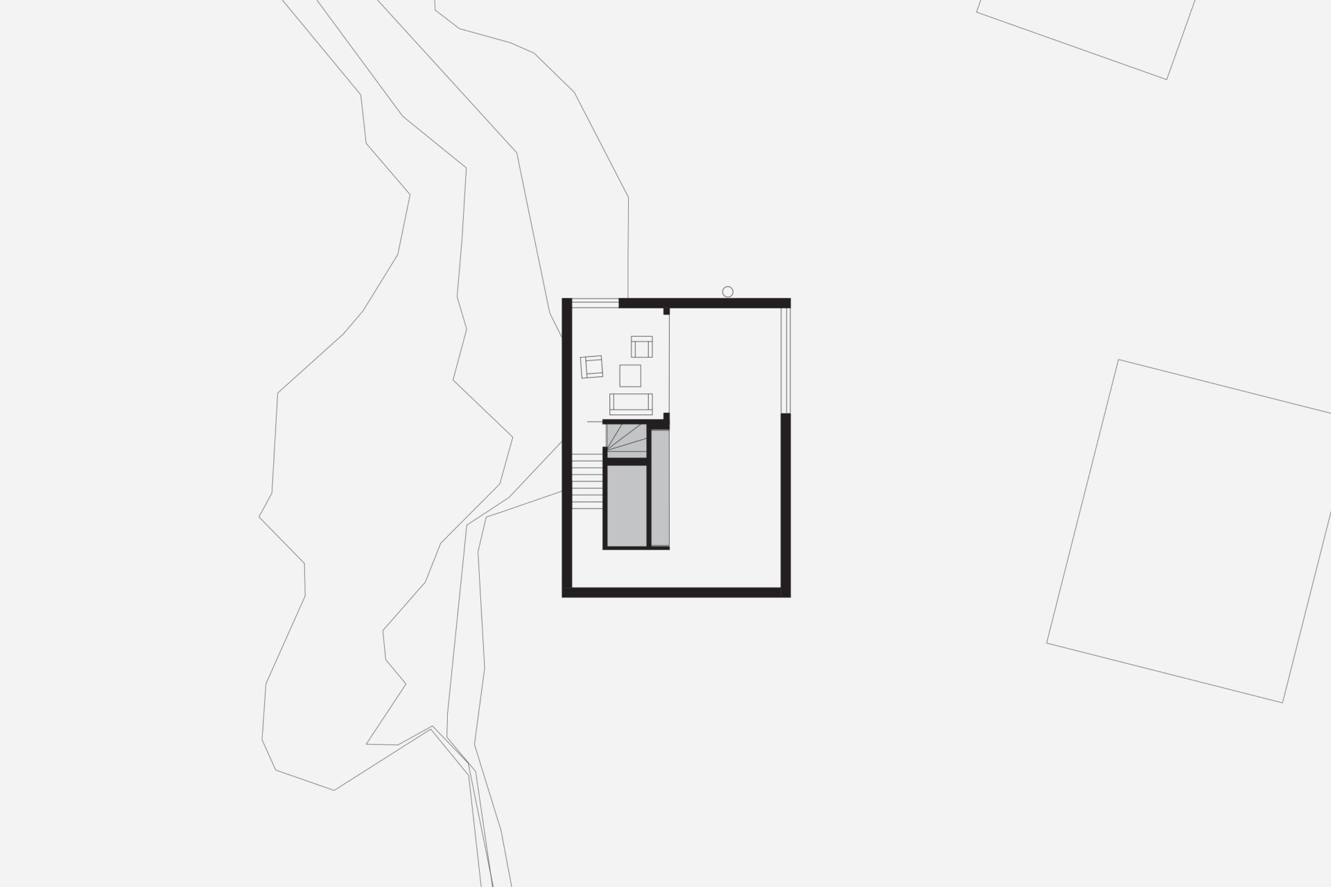
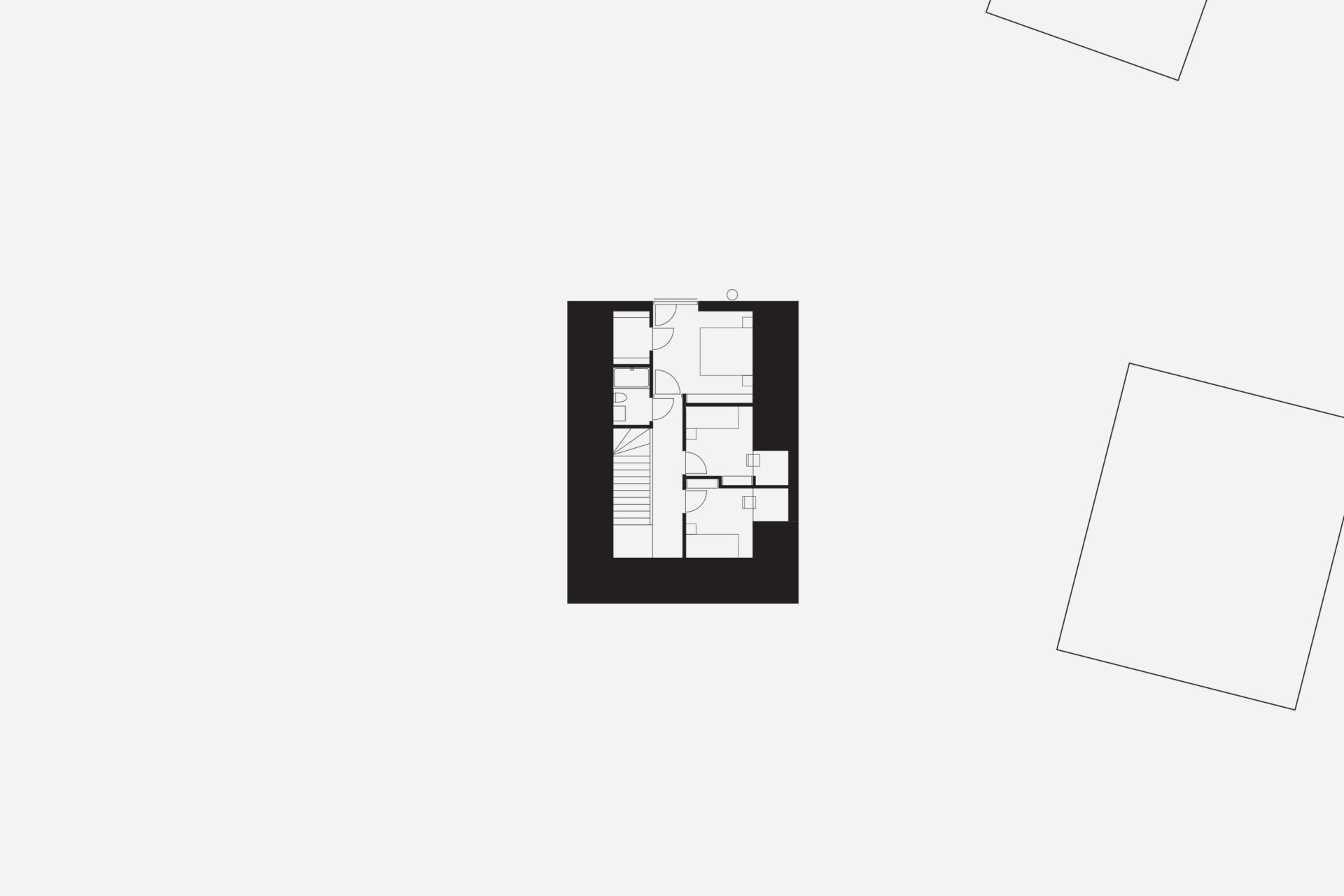
The house is located on the border between a flatter lower landscape and an elongated higher ridge. Like coarse pixels, the rooms on the ground floor are adapted to the plot’s high-resolution topography. Different functions are at different heights, but within the same space. The living room is at the bottom. On an intermediate level are the kitchen, entrance hall and bathroom. On an upper level, overlooking the nearest bay is the library/ guest room. With a ceiling at a constant level and floors at different levels, the room height varies greatly. The common functions naturally have the highest room height, and the adapted heights of the floor levels provide direct connections to the outside entrance area and terraces. The bright interior of the living room and kitchen and large varied openings towards three directions compensate for dark winter months based on the client’s partly southern European origins and longing for light. The top floor is another world. Separated from the other functions are three bedrooms and a bathroom arranged under a steep gabled roof, which provides typically cozy attic rooms. Wood is used consistently in frames, facades, and roof.
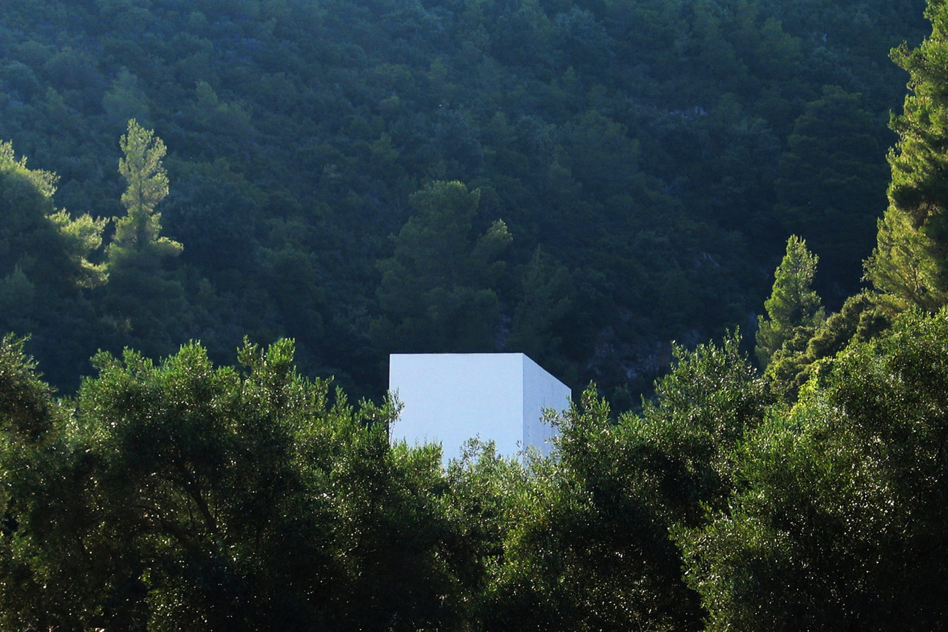
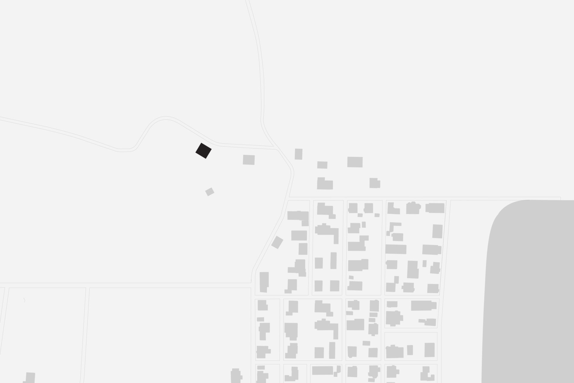
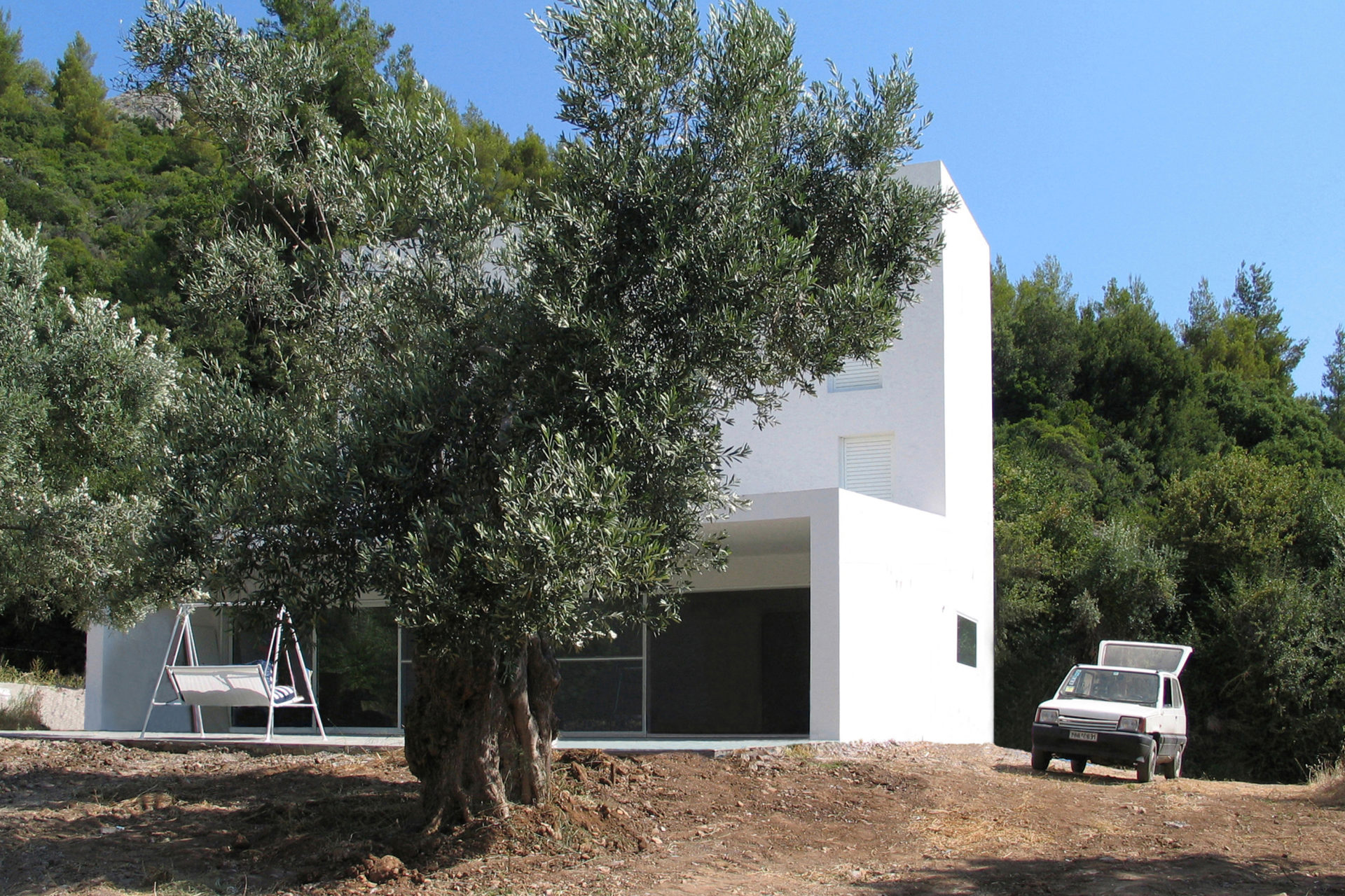
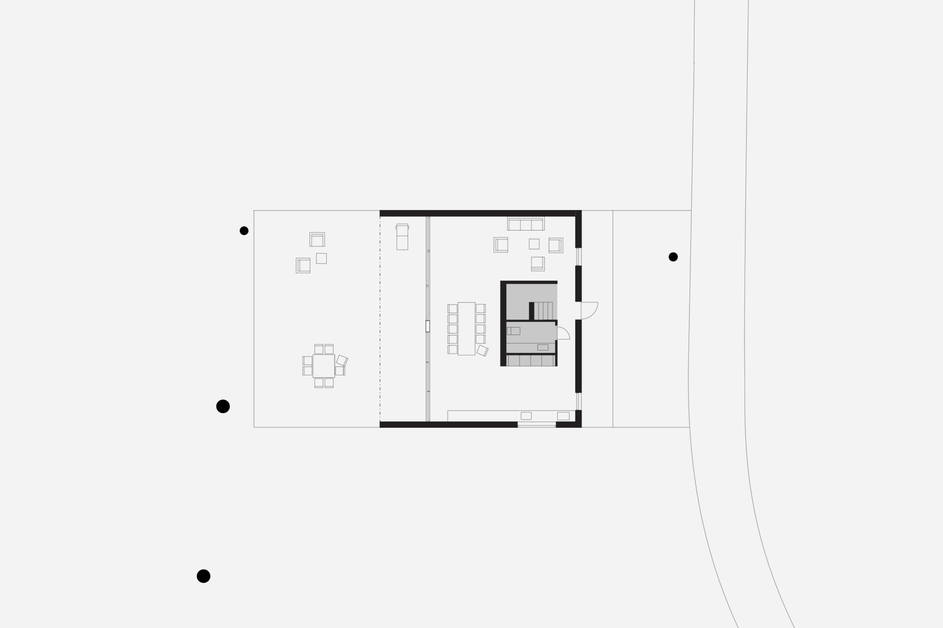
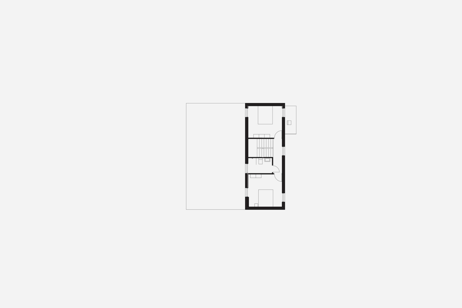
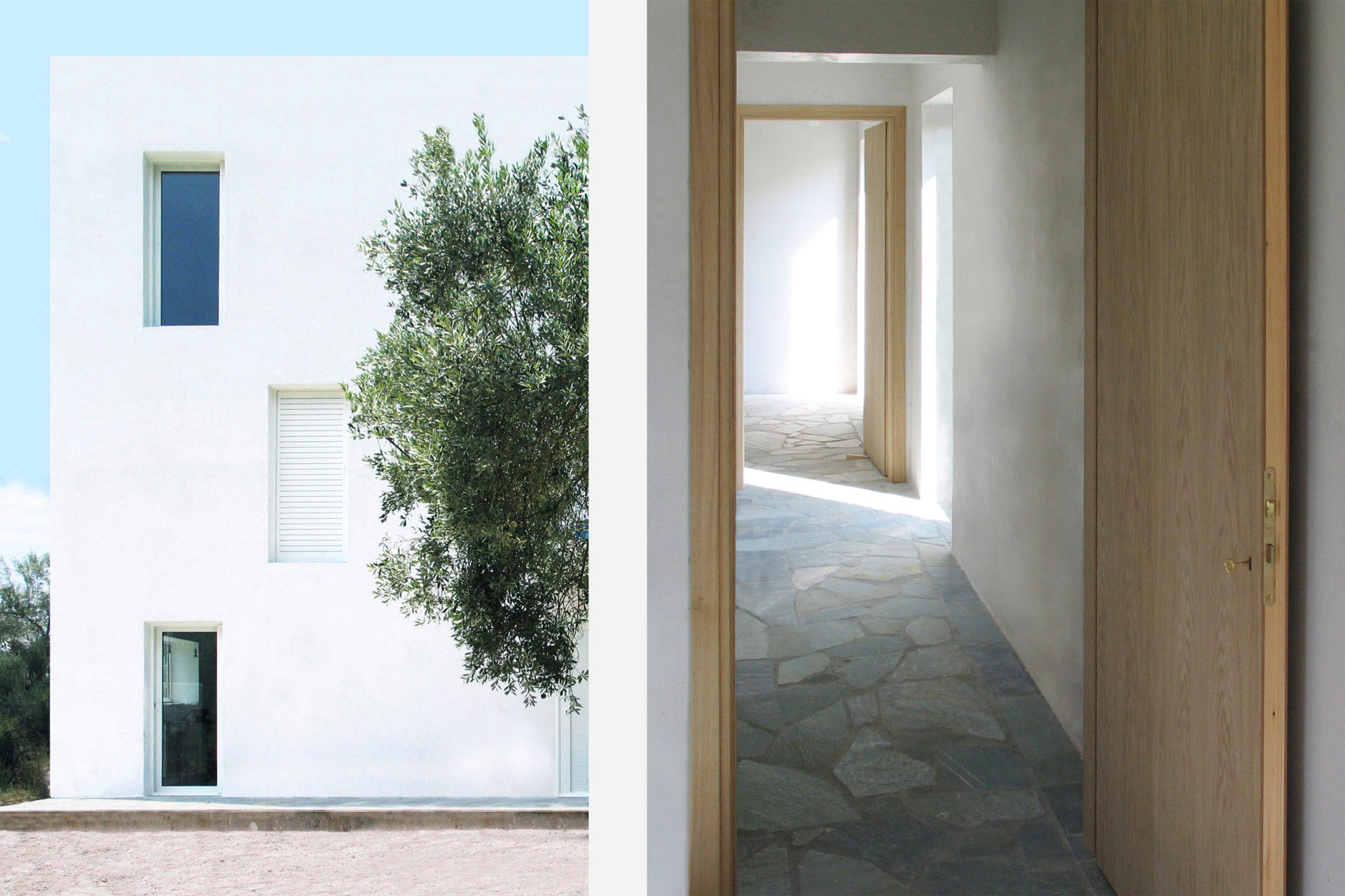
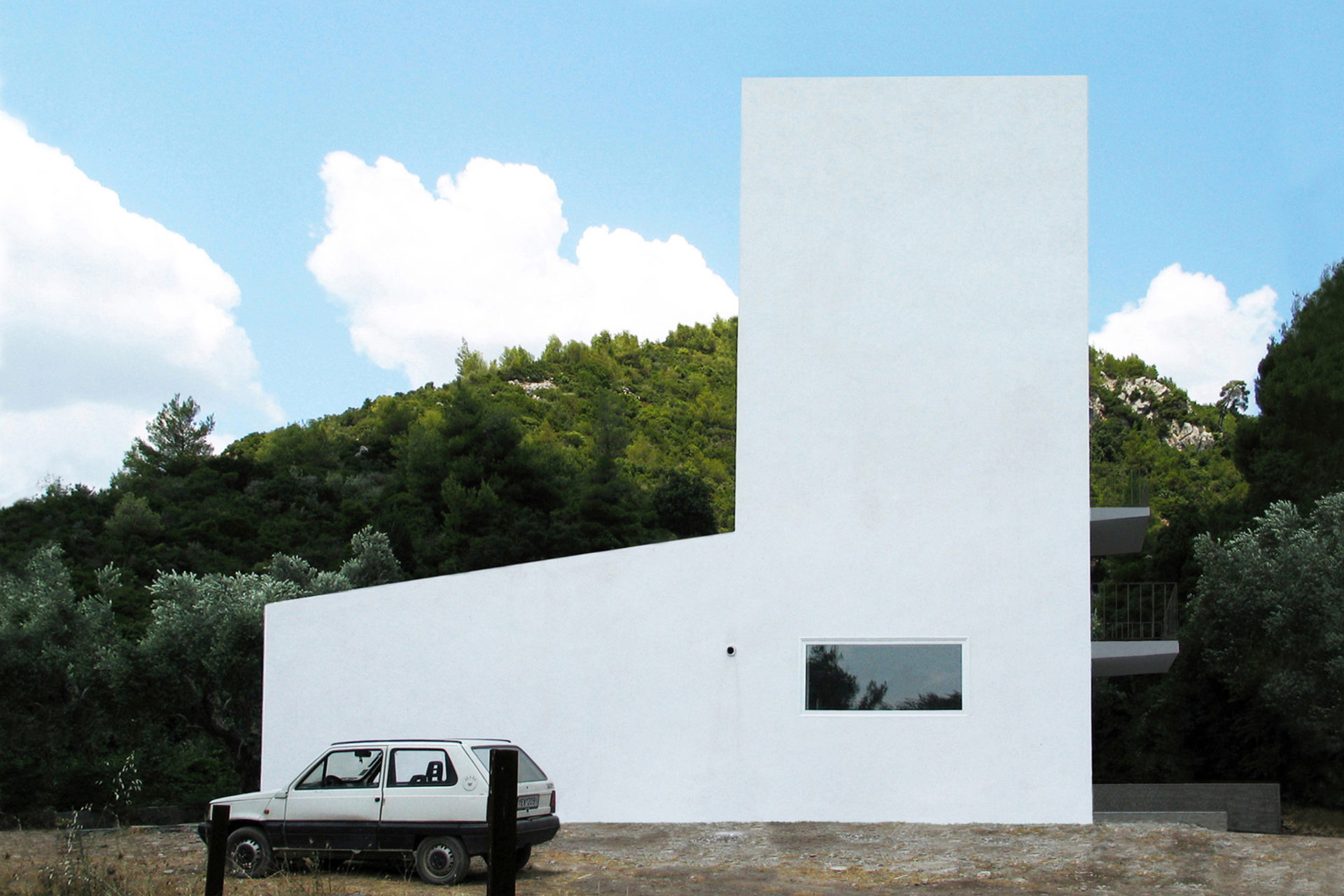
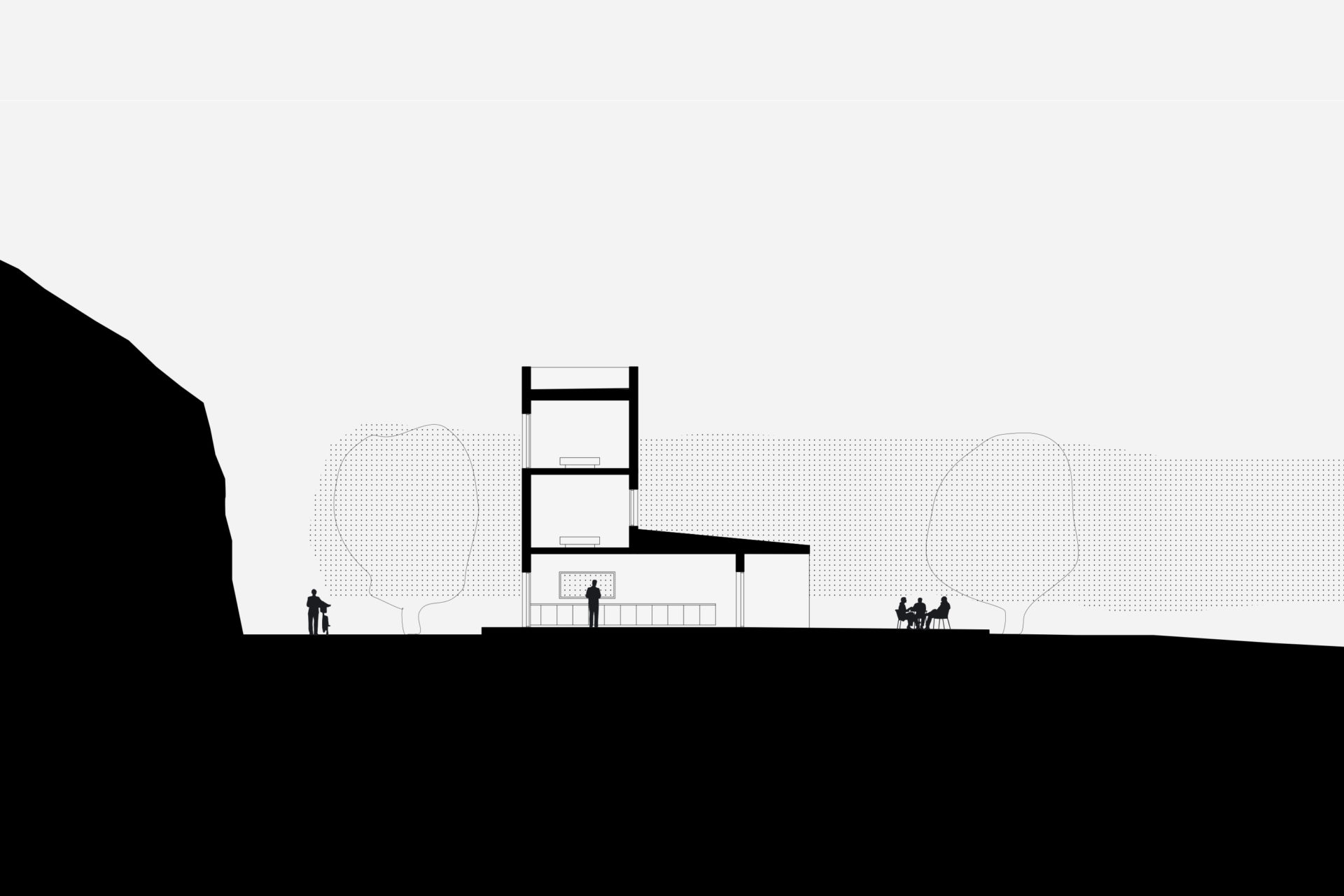
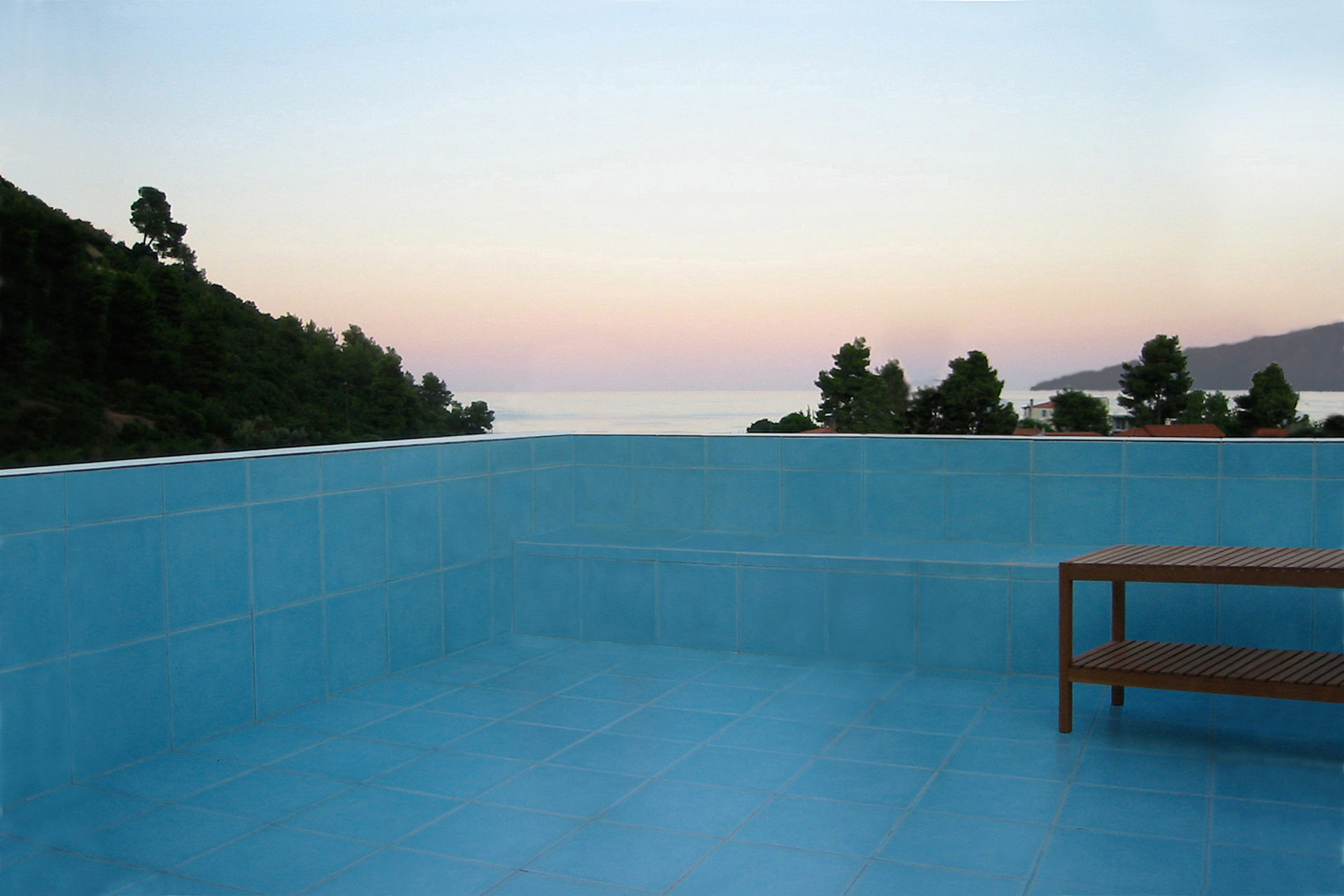
500 year old olive trees, a high ridge next door, and the Aegan Sea nearby, provided a distinct frame. To save trees, a small footprint was required and the result is a vertical building with common rooms on the entrance floor, and bedrooms on two floors above. The whole provides opportunities for family and guests to meet and to retreat in peace and quiet. Living room and kitchen are at ground level completely open towards the garden. Floors 2 and 3 are identical, each have two bedrooms and one bathroom. French balcony windows in opposite walls provide natural cross-ventilation. Despite the climate, mechanical air conditioning is not needed. A roof terrace delivers the finale in the relationship between the rooms and the trees: below, inside and above. Construction methods follow local traditions with cast-in-place concrete, whitewashed brick walls, and green slate floors. The house is a part of the village but stands in its surrounding agricultural landscape creating a gray zone where continued olive harvesting and summer life coexist. (finished during studies, 2002)
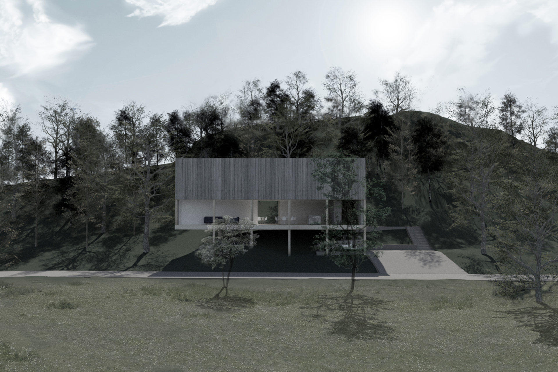
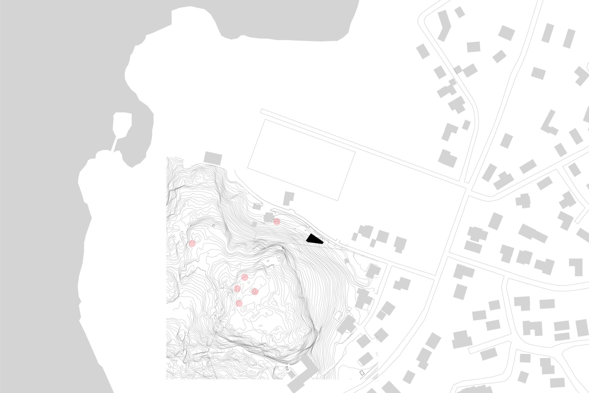
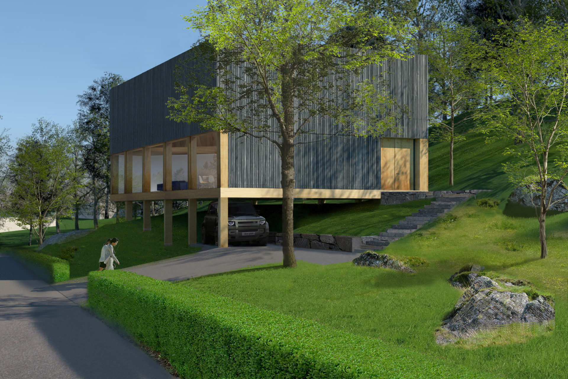
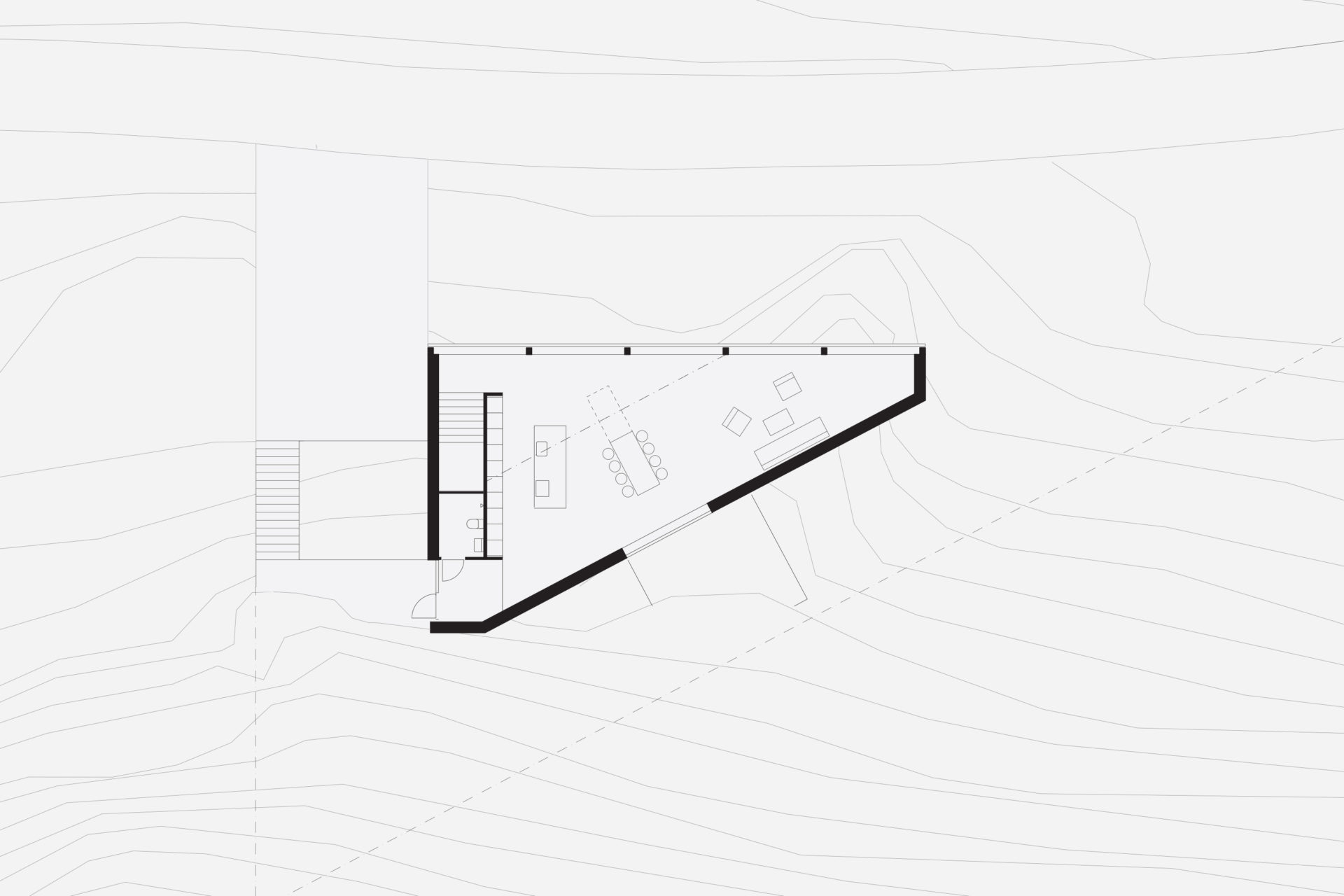
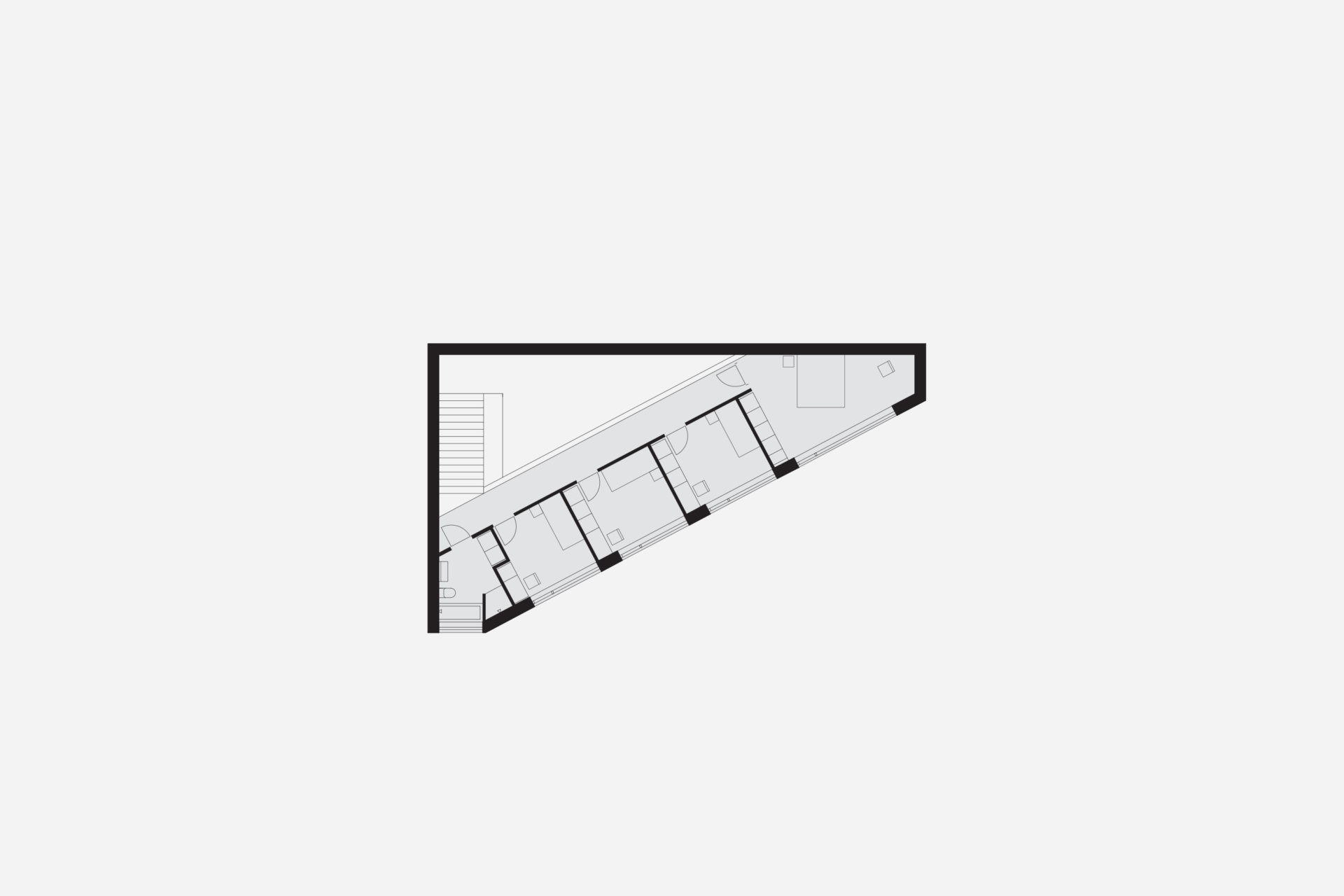
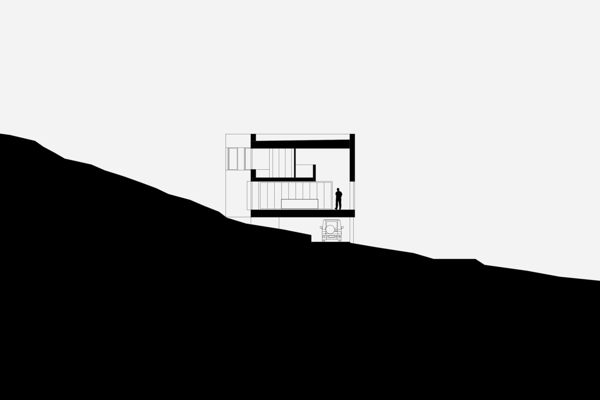
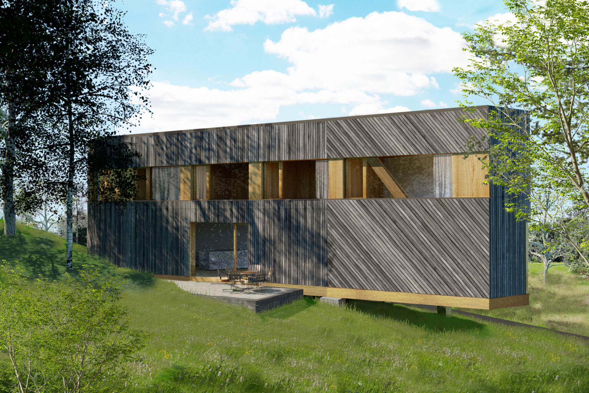
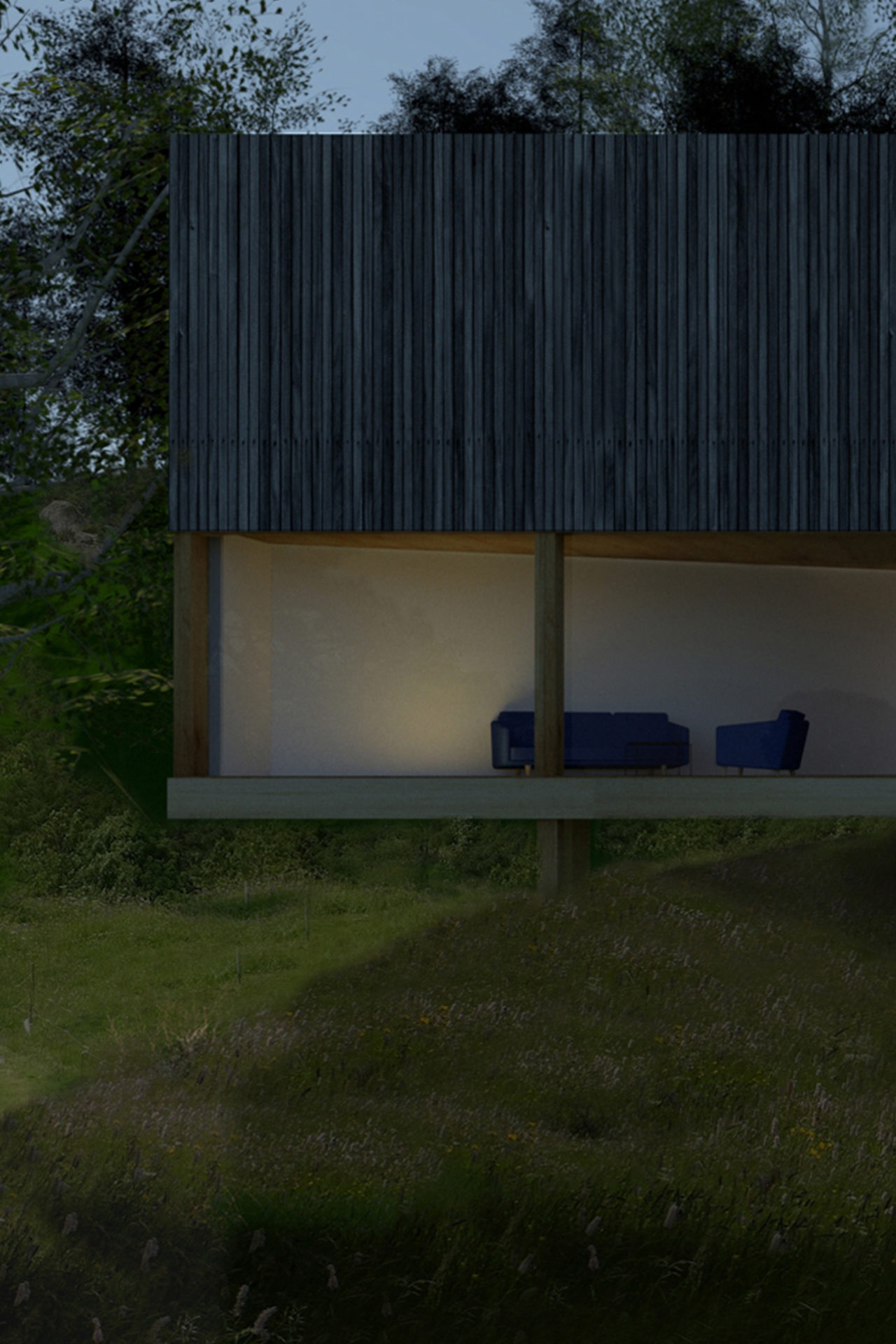
What would be left of a newly built house in 3000 years? If it was built of wood and natural materials, perhaps only the remains of a stone staircase. The site’s 3,000-year-old rock carving from a prehistoric settlement raised these long term concerns as part of the founding strategy for the house. To achieve the greatest possible distance from the remains, the building was placed as far into the plot’s wedge as possible. The triangular property boundary became a mold for the house, and the internal is adapted to the external and the client’s wish for a total area of 200 sqm. With a foundation on pillars, the footprint would be minimal and the terrain in which the rock carvings had survived three millennia would not be lost. A stone staircase follows the slope to the level where the entrance hall naturally connects to the ground. The first floor comprises a large room with kitchen and living room and a window strip towards the entrance road and further on a horizontal landscape. Light conditions in the room vary greatly in relation to its varying depth of 1.5-10 meters. The second floor with four bedrooms and bathroom faces the private mountainside. The repetition of the smaller rooms runs efficiently along the longest side of the building and the complicated triangular shape that´s left is transformed into an asset as a double-height triangular void.
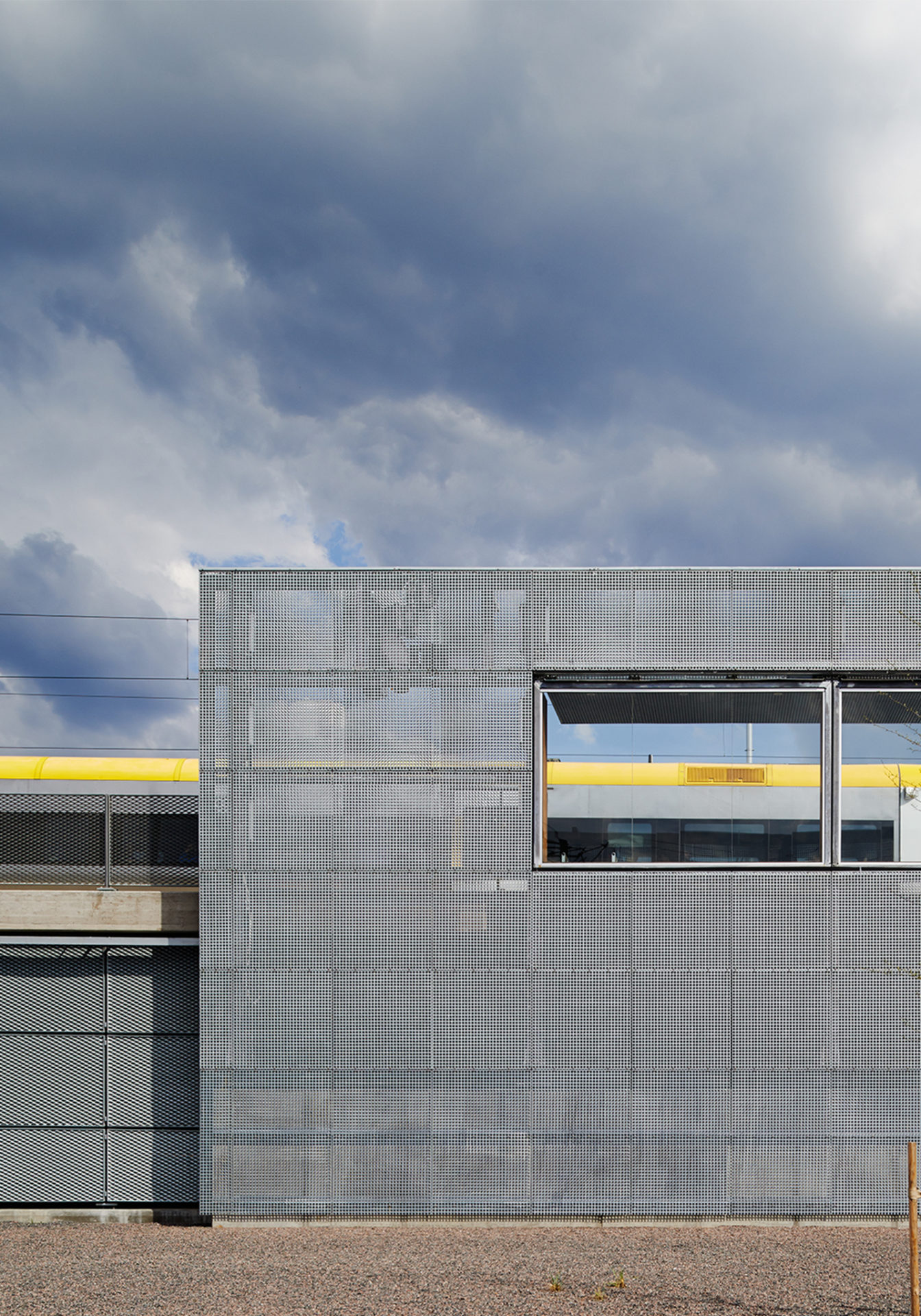
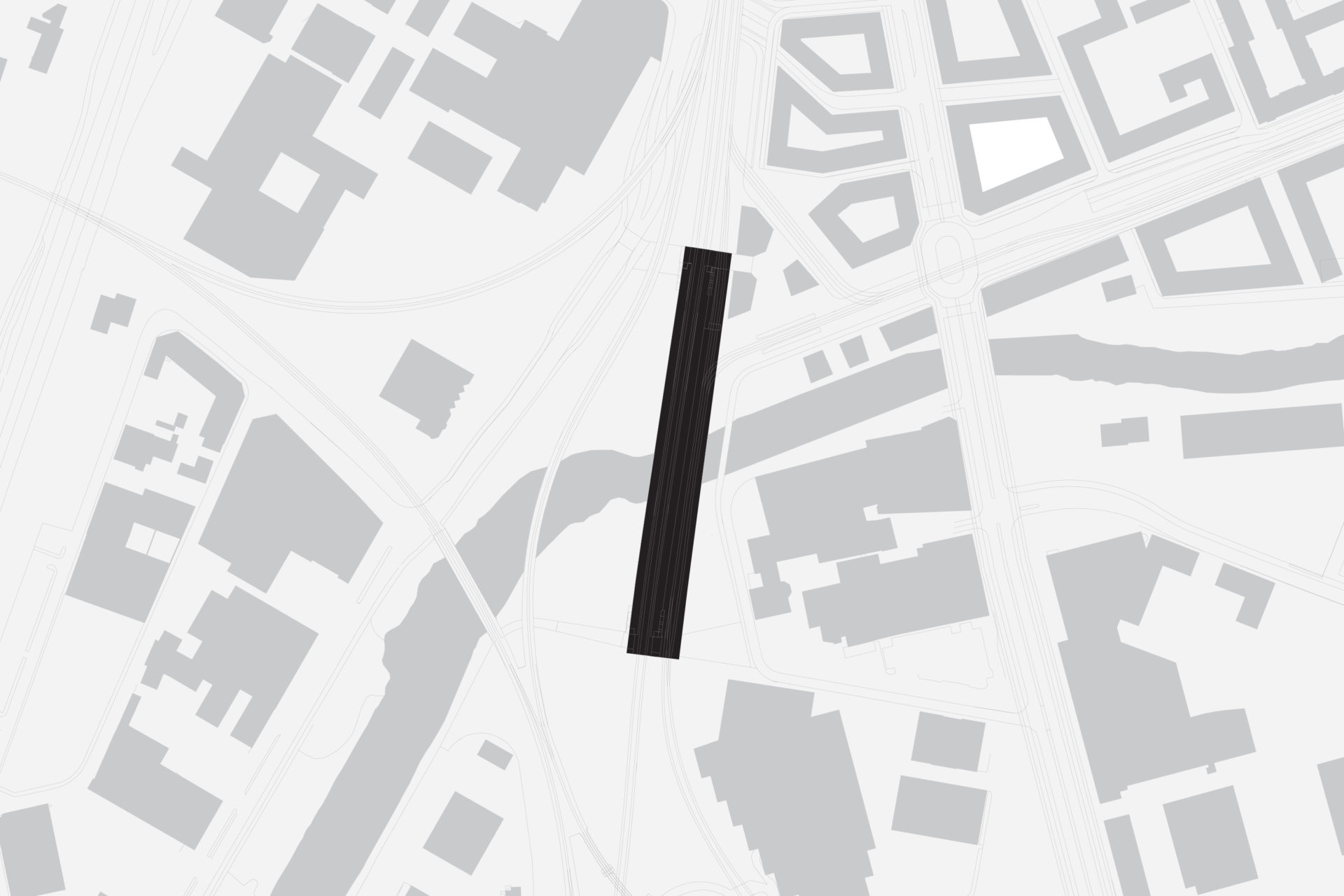
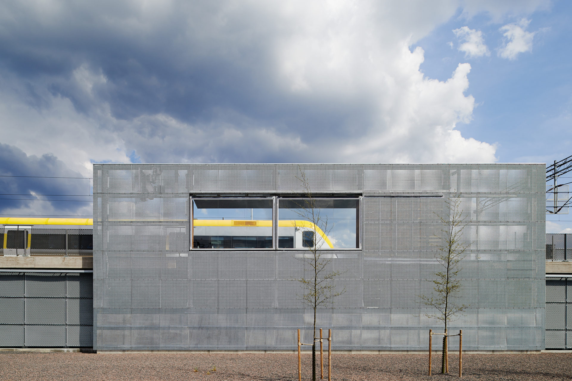
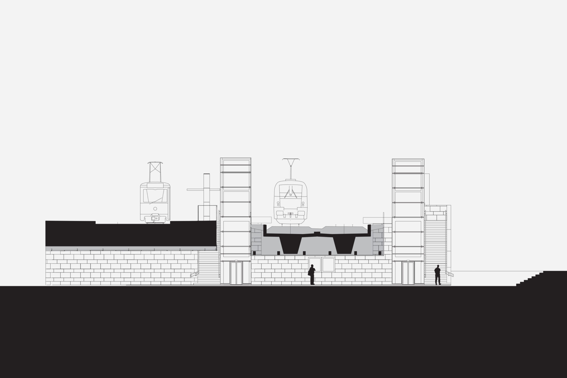
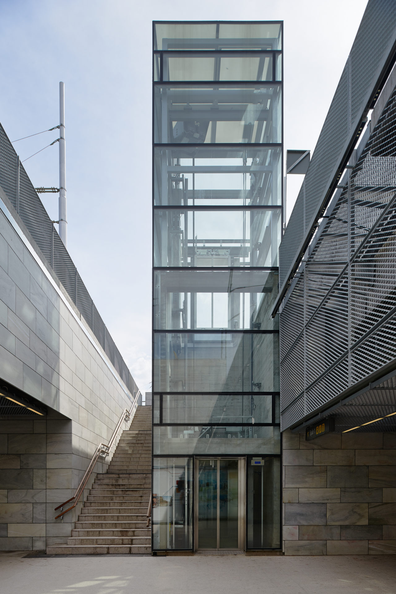
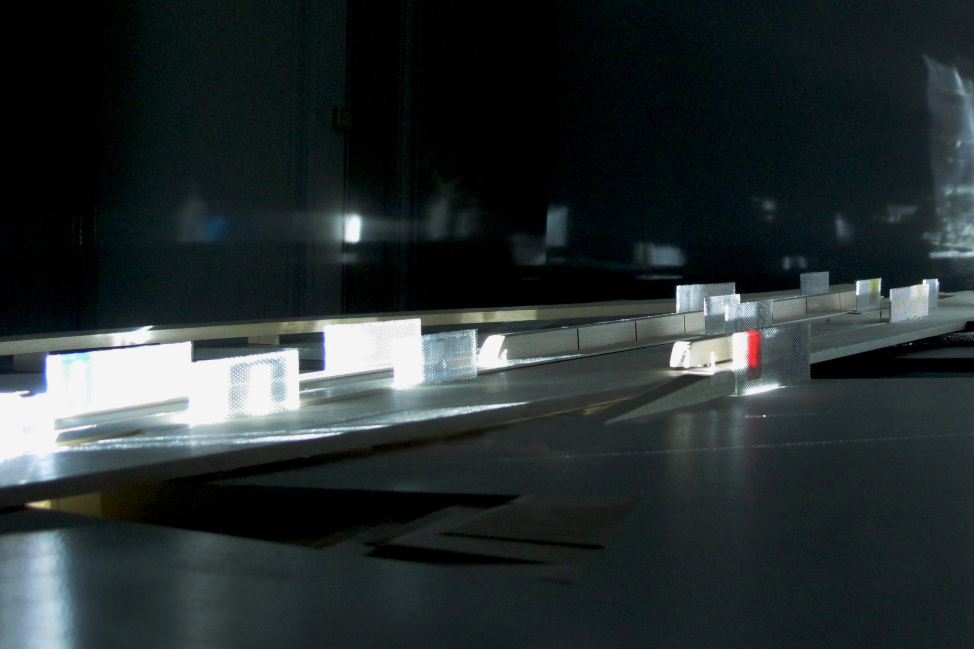
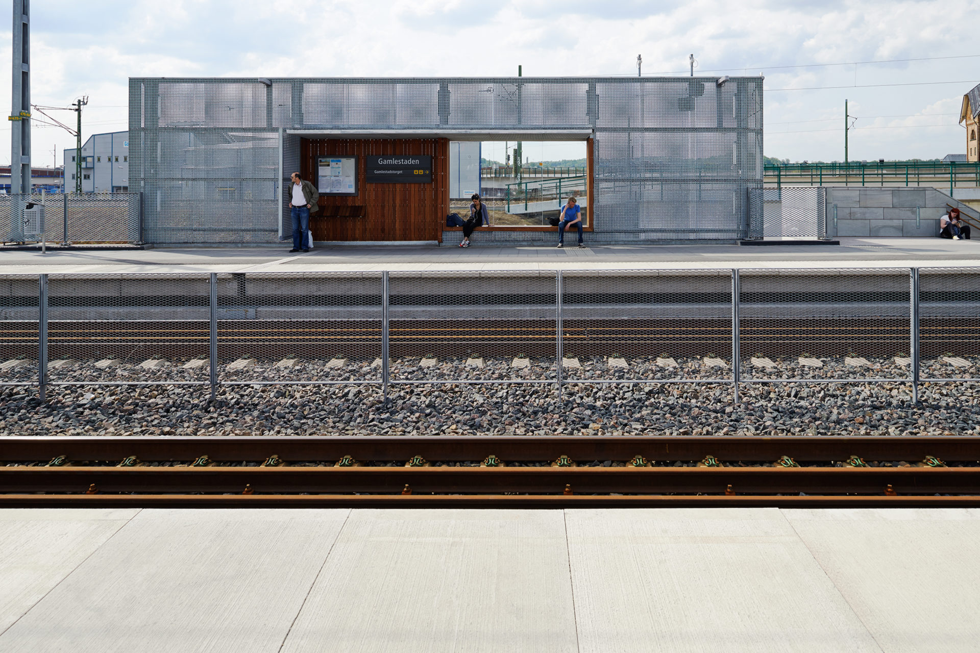
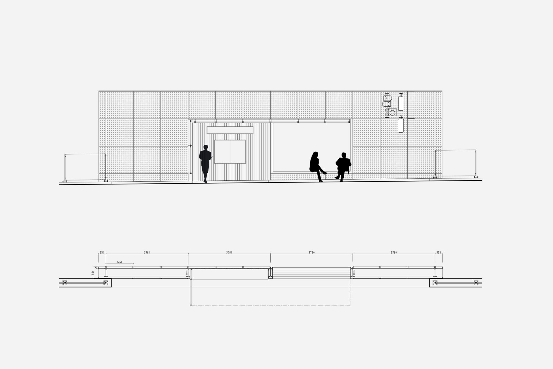
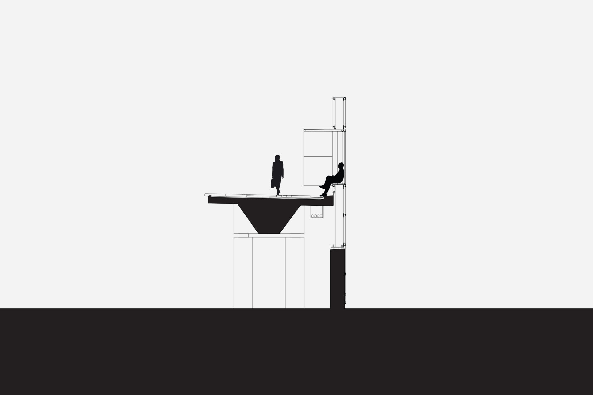
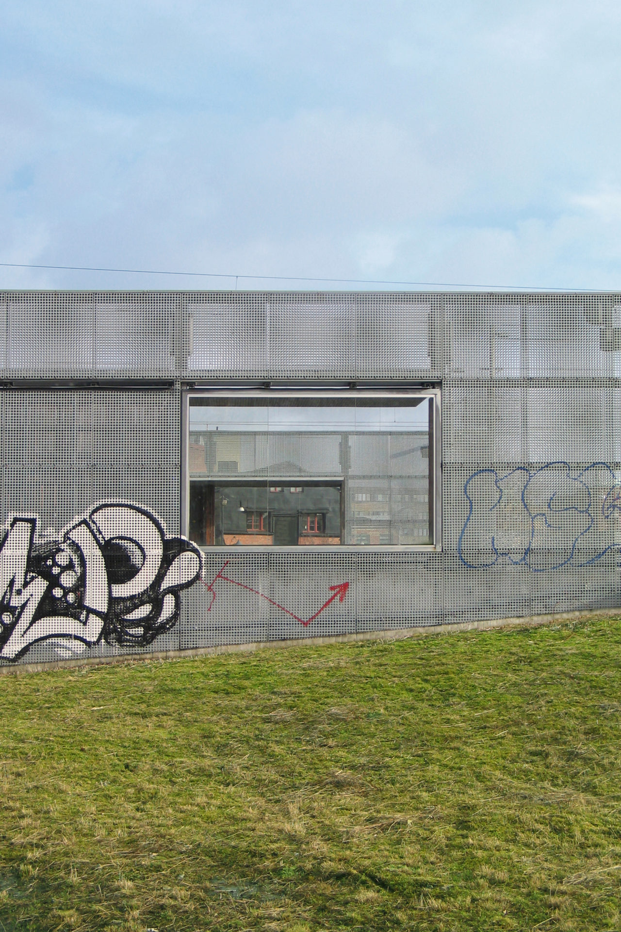
The commuter train station’s marriage with an older tram crossing was the first step in the district’s ongoing transformation. Increasing passenger numbers will continuously support the transformation as travel grows naturally with the surroundings and the train station becomes part of Gothenburg city’s giant train barrel project. In addition to distributing public transport, the station now connects different localities. The platforms are bridges over a river, functioning both as points of entry and exit from trains and as footbridges between a southern older factory area and the district’s new square. Two wide cross-connections under the tracks connect the square with the reborn Slaughterhouse area, and include a high speed cycle track feeding into the city center. A simple structure in terms of materials and construction was necessary considering that in a short time several principals should agree on building the whole as a whole. The railway’s galvanized contact poles are the origin of a unifying material strategy, where galvanized metal was the least common denominator. The various parts of the station consist of metal with elements of glass, stone, and warm wood on selected parts where travelers come close to the otherwise colder durable materials. The perforated metal of the weather protections reduces the wind turbulence around the walls, which in their large format are vertical windbreaks in the open railway landscape. The project was completed in collaboration with Frenning & Sjögren.

